

Updates for lifetime, unlimited sites, unlimited downloads, and regular updates.
$3.99
 BookmarkBookmarked
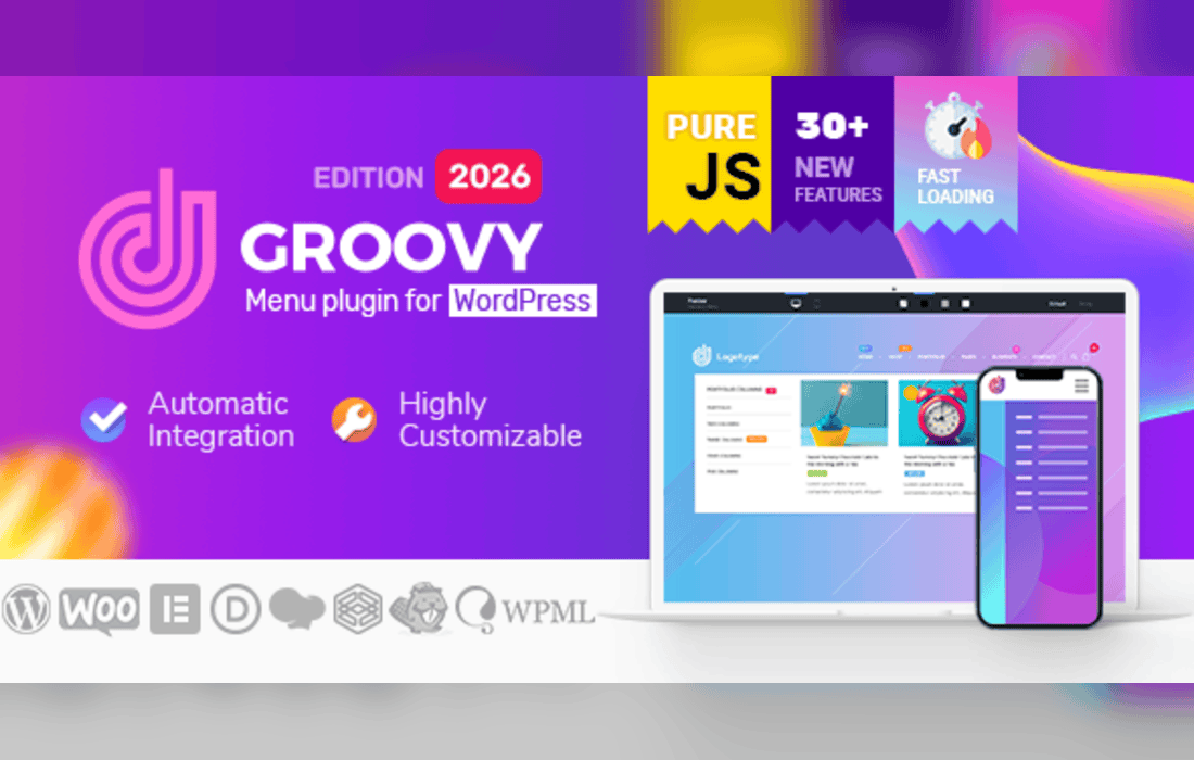
Groovy Menu is a responsive mega menu plugin for WordPress that ships with a library of ready header presets, so you can begin from a finished design and adapt it. It supports horizontal and vertical navigation, off canvas, slide and push menus, sticky and fixed headers, and widgets or shortcodes inside mega menu blocks. It also adds badges and Ajax WooCommerce cart and search, and it works with Elementor, WPBakery, Divi and Gutenberg.
A good menu starts with the structure of the site rather than the styling. List the main sections a visitor needs, group smaller pages under the section where they belong, and keep top-level labels short enough to read at a glance. Mega menus reward careful grouping, because a wide panel full of unrelated links is harder to scan than a tidy column for each section. Review the list with a few people who did not build the site, since they will notice labels that make sense only to the team.
The layout options cover the patterns sites use most often. Horizontal and vertical navigation handle the primary menu, while off canvas, slide and push styles give mobile visitors a panel that opens from the edge of the screen. The layout library also includes hamburger, sidebar, collapsible sidebar, expanding, full screen and one page menus, so you can match the navigation to the shape of your content instead of forcing everything into one pattern.
Mobile behavior is equally adjustable. You can disable the mobile or the desktop menu independently, so each device shows the navigation you intended. Individual items can also be hidden on mobile along with their content, which helps when a large desktop menu would otherwise overwhelm a small screen.
The header library supplies pre-made header designs, which saves time when a project needs a polished header quickly. Designs can be adjusted for colors, fonts and sizes, so the starting point can still reflect your brand. Sticky and fixed headers keep navigation within reach while visitors scroll. The plugin also handles navbar and top bar elements for sites that want a utility strip above the main navigation.
Mega menus provide large panels for navigation-heavy sites. Full-width mega menus stretch across the page, and WooCommerce mega menus suit stores with large catalogues. Dropdown and submenu options cover simpler structures, so a brochure site can keep a narrow menu while a catalog-heavy store opens wide panels from the same plugin. Each project can use the pattern that fits its structure.
Any widget or shortcode can be placed inside a mega menu block. That opens up layouts such as a newsletter sign-up, a promotional banner, a list of recent articles or a search field inside the menu panel. The [groovy_menu] shortcode displays a menu inside widgets and other content areas, so the same menu can appear in a sidebar, a footer or a custom page.
Badges can be added to menu items as icons, text or images. A badge is a simple way to draw attention to a new section, a seasonal area or an important destination without changing the link itself. Individual items have their own options, including the ability to hide a menu item and its content on mobile. Used with restraint, that control lets you keep a rich desktop menu without crowding the mobile experience.
Stores can use the Ajax Cart and Ajax Woo cart options, which let shoppers see updated cart contents without a full page reload. Search is prepared for Ajax behavior, and the plugin is compatible with Ajax Search Pro. Together with the WooCommerce mega menu, these options help shoppers move between categories and checkout with less friction.
The plugin works with Elementor through a dedicated widget element, and with the Divi Theme Builder through its own module. WPBakery and Gutenberg are supported as well, alongside WPML and WooCommerce. It also works with Fusion Builder for Avada, Thrive Architect, Oxygen Builder, Brizy, UX Builder for Flatsome, Beaver Builder, Cornerstone and SiteOrigin, and Bricks is supported too.
Automatic integration outputs the menu right after the opening body tag, which suits most themes without any code. Manual integration lets you place the menu where your template requires it. Theme Locations integration connects the menu to the locations your theme already defines. A Groovy helper plugin covers themes where a child theme is not practical. Choosing the method early avoids reworking the header later.
Presets can be assigned to tags, categories and custom taxonomies, so one section of a site can carry its own navigation style. A default setting can hide the Groovy menu where it is not wanted. Separate desktop and mobile logos can be used, and an alternative logo option switches the logo when a page calls for one. Icon packs can be uploaded for menu items, and Font Awesome can be switched off if your site does not use it. An animated hamburger icon is available for mobile navigation.
Presets can be imported and updated, and menu blocks can be exported from one site and imported into another. Inline critical CSS can be enabled as a performance option. Custom code areas and developer actions let you insert your own markup at defined points when a project needs a bespoke addition. The scrollbar and one-page section includes anchor-link tracking for single-page sites.
A menu appears on every page, so small decisions add up. Use compact images for badges and logos, avoid placing heavy embedded media inside mega menu panels, and limit the number of widgets in each panel to the ones visitors actually use. If a menu feels slow on a phone, measure the page first to see whether the menu is the cause or whether the problem lies elsewhere in the theme. Keeping the menu lean makes the whole site feel more responsive.
The plugin supports WPML, so menus can follow the translations on a multilingual site. Right-to-left layouts are part of the design, and the showcase examples include a Hebrew menu. The showcase also presents CJK and Unicode menu labels, which helps sites that use non-Latin scripts. Test each language with real menu labels, because longer words in German or Finnish can wrap differently from English ones.
Once the structure is set, test the menu with a keyboard alone, then with a touch screen, then with a screen reader. Check that focus states are visible, that touch targets are large enough to tap without precision, and that open panels can be closed without a mouse. Look at the menu at several widths, paying attention to the point where the desktop layout gives way to the mobile one. Testing these details early prevents an awkward discovery after launch, when changes are slower and more visible to visitors.
Menus drift as sites grow. New pages appear, old campaigns finish, and links quietly break. Set a regular review, perhaps every few months, to remove dead entries, check that every top-level label still matches the content beneath it and confirm that new sections are reachable. Keep a short note of what changed and when, so the next person who edits the menu understands why it looks the way it does. A menu that is reviewed on a schedule tends to stay useful for longer.
Changing a header is easier when the work is split into stages. Start by listing the menu items that receive the most clicks, then decide which of them belong in the primary bar and which can move into a submenu or a mega panel. Build the new header on a copy of the site, ask a few regular visitors to try it, and compare the results with the old layout before switching. Keeping the previous configuration on hand makes it straightforward to return to the earlier version if the new one causes confusion.
Groovy Menu is compatible with WordPress 7.0, WooCommerce 10.x and PHP 8.x. Supported browsers include Chrome, Edge, Firefox, Opera and Safari. Export your menu blocks before a major change so you have a restore point, and try the menu on a development site before changing a live header, especially if your theme overrides header markup or your site uses a caching plugin that stores rendered pages.
Groovy Menu brings a broad set of layouts, presets and integrations into one plugin, so the navigation can keep pace as a site’s structure grows.


