

Updates for one year, unlimited sites, auto updates, and regular updates.
$3.99
 BookmarkBookmarked
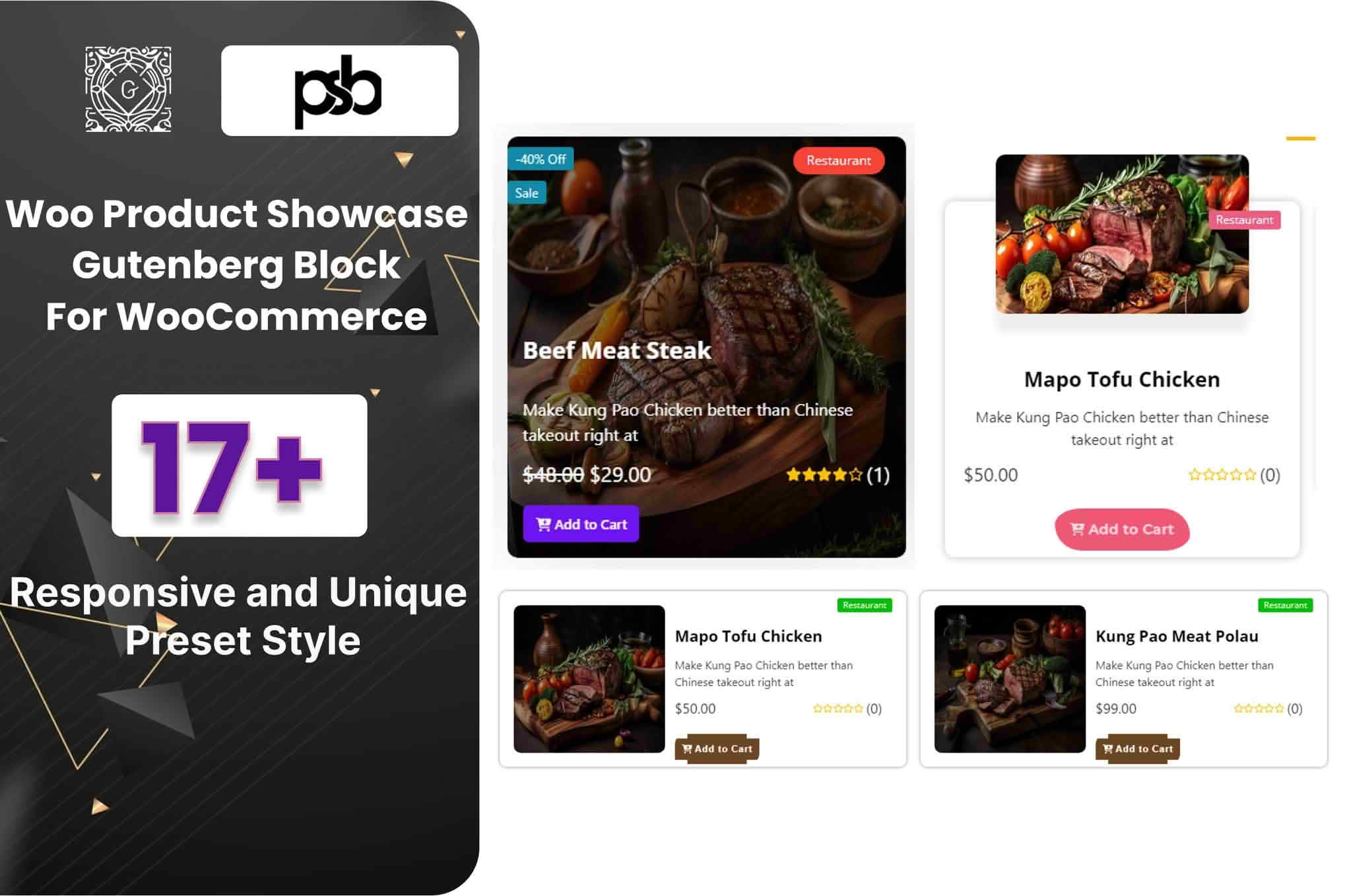
WooCommerce Product Showcase Gutenberg Block is a block for the WordPress block editor that displays WooCommerce products in grid-style layouts on a page. According to its product listing, the block is designed for building product displays directly in the editor, so a page can be composed and checked in the same place where other content is written. This entry covers what the listing describes, how a block of this kind is usually used, and what a store should confirm before adopting it for a live site.
The block takes WooCommerce products and arranges them for display on a page, post or landing page. Because it is a block, it sits alongside headings, paragraphs, images and buttons, which makes it possible to build a product section as part of a wider page rather than as a separate area. The listing names grids, sliders and cards among its layout options, and it describes the design as adjustable to suit a site.
The listing states that no coding is required to build these displays. That makes the block relevant to store owners who prefer to work visually, and to people who manage a shop without writing theme or template code. Nothing in the listing suggests that a developer is needed for everyday use, although a developer may still be useful for unusual layouts or for styling that goes beyond the options provided.
The listing names layout options in two places, and the two descriptions are not identical. Its overview refers to grids, sliders or cards as layout choices, while its feature list refers to grid, list and tile styles. A reader should therefore treat the exact set of layouts as something to confirm in a demonstration or on a test installation, rather than assume it from either summary alone.
The listing also states that the block includes 18 preset styles. Preset styles are usually a starting point, giving a display a complete look before any individual setting is changed. The listing does not explain how the presets differ from one another or how many layout options each one contains, so those details are worth checking before a design is chosen.
According to the listing, the design can be customised so that product images, titles, ratings and add-to-cart buttons suit the style of a brand. These are the product elements the listing names specifically. It also mentions advanced options without describing what they include, so anyone who needs a particular control should confirm that it exists before depending on it.
Add-to-cart buttons deserve particular attention. In a product grid they allow a shopper to move from browsing straight to the cart, so their size, colour and placement affect how easily that step is taken. Whether the buttons match the rest of a theme depends on the theme’s own styles, so a visual check on a staging copy of the site is a sensible step after any change.
Product images matter just as much. A grid looks most orderly when images share a similar shape and background, and when titles are short enough to read at a glance. Ratings, where they are displayed, help shoppers compare items quickly. Consistent treatment across the items in a grid usually reads more clearly than a mix of styles.
The listing says the block can highlight featured products, best-selling products or new products. Those three selection types give a store owner a simple way to show the items that matter most at a given time, such as a new range, a set of items that have been popular, or the products a shop wants to lead with on its home page.
The listing does not mention selecting products by category or by tag. A store that needs a display limited to one product category should therefore confirm that option during a demonstration or on a test site before building the layout around it. Whichever selection method is chosen, a display can only be as current as the catalogue behind it, so regular catalogue checks are worth scheduling alongside the block settings.
This product suits WooCommerce store owners who build their own pages in the block editor and want a product display without writing code. It also fits designers who build sites for clients and need a product grid that can be styled to match each brand. Marketing teams that refresh landing pages regularly may find a block-based display quicker to update than a template that has to be edited by hand.
A small shop with a modest catalogue can use the block to feature a handful of items on the home page. A larger store may prefer to place a display on each category landing page, using the same block in several locations with different selections. In both cases the block works as a display element, and the listing does not describe search, filtering or catalogue management features.
A common approach begins with adding the block to a page in the editor. The product selection is set to featured, best-selling or new products, a layout style is chosen from the options available, and the appearance settings are adjusted to suit the site. The page is then previewed before publication, so the result can be seen in context with the surrounding content.
Responsive behaviour is worth checking at this stage. The listing describes the block as fully responsive, which means the display is intended to adapt to different screen widths. A preview on a laptop, a tablet and a phone will show whether that claim holds for the theme and layout in use, and it is quicker to correct any issue before the page goes live than afterwards.
Editors who are new to block layouts can apply the habits they already use for other blocks. Make changes in small steps, preview after each change, and save a copy of the page before a major redesign. These habits reduce the risk of a layout breaking unexpectedly and make it easier to return to an earlier version.
The listing says the block is built for WooCommerce shops, but it does not name a minimum WooCommerce version. It states that the block is compatible with the latest WordPress version, and it does not give a minimum WordPress version either. The listing also says the block works well with WordPress themes generally and offers cross-browser compatibility, but it names no specific themes and shows no independent testing.
The listing does not state PHP version requirements or hosting needs. Before installing the block on a live store, it makes sense to confirm the WordPress and WooCommerce versions running on the site, read any release notes, and test the display on a staging copy. A site that is kept up to date is generally easier to support than one that has fallen several releases behind.
The listing describes the block as optimised for performance and presents its code as clean and well documented. These statements are the product’s own claims, and they should be read as such. A product grid that loads many large images can slow a page, so store owners commonly keep image sizes reasonable and test page speed after adding a grid. Limiting how many products one display shows is a common way to keep a page light.
Clarity matters as much as speed. A grid works best when titles are short, buttons are easy to find and spacing between items is consistent. These are general layout principles that apply to any product display, whichever block or theme is used to create it, so they are worth keeping in mind during setup.
A product display should be usable by everyone who visits the site. Product images benefit from meaningful alternative text, headings should follow a logical order, and buttons should carry labels that explain their purpose. Colour contrast between text and background should be checked, particularly when a theme or preset applies a light colour scheme. Keyboard users should be able to reach each add-to-cart button without difficulty. Whether the block supports every one of these points depends on the theme and the settings chosen, so a manual check is advisable.
A product display is only as current as the catalogue behind it. Featured, best-selling and new selections change over time, so the page should be reviewed on a regular schedule to make sure it still reflects what the store wants to show. Plugin updates should be tested before they reach the live site, and any change in layout should be checked on each type of device before the update is accepted.
WooCommerce Product Showcase Gutenberg Block gives store owners an editor-based way to present WooCommerce products in grids and other layouts, to choose featured, best-selling or new items, and to adjust the look of each display. The listing is clear on those core functions. The points that need confirmation before relying on the block are the exact layout set, the presence of any category option, the minimum WordPress and WooCommerce versions, and the scope of the advanced options.


