

Updates for one year, unlimited sites, auto updates, and regular updates.
$3.99
 BookmarkBookmarked
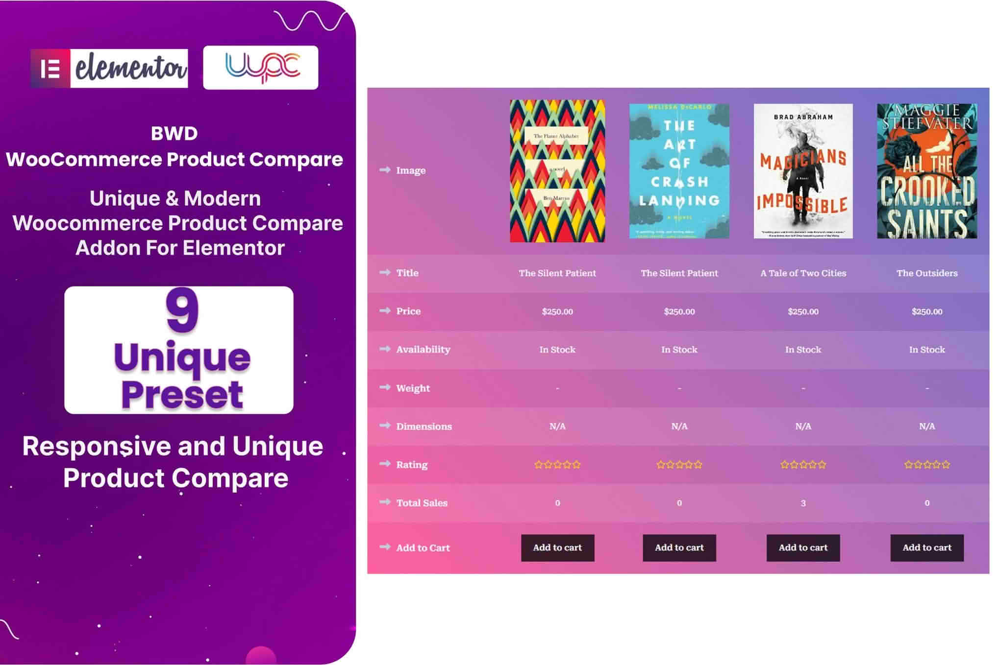
Shoppers rarely settle on the first product they open. They switch between tabs, try to remember which model had the better specifications, and wonder whether the simpler option will really do the job. WooCommerce Product Compare Addon For Elementor offers a calmer route through that decision by placing two products side by side inside a page you build in Elementor. Rather than asking visitors to hold details in their heads, the widget presents the essentials in a comparison view that stays easy to scan on both a laptop and a phone.
Comparison pages answer a question that many buyers ask quietly while they browse: which of these fits my situation best? When the answer sits in one organised place, visitors spend less time hunting through separate pages and more time making a choice. Stores that sell related items in several sizes, finishes, or models often notice that a comparison view reduces repeated back-and-forth between product pages. It also gives hesitant shoppers a reason to stay on your site rather than opening a competitor’s catalogue in another tab.
The plugin is designed around Elementor, so the comparison appears as a widget you add to any page built with that editor. Setup requires no programming, which means you can work entirely through Elementor’s visual interface. Place the widget where it belongs, choose the preset layout that suits the page, and then adjust the surrounding sections until the comparison sits comfortably alongside your other content.
If your product pages already follow a particular design system, you can carry that look into the comparison. Every element of the widget can be styled through Elementor’s visual editor, from colour choices and buttons through to animation effects. The comparison therefore does not need to look like a bolt-on feature. It can share the typography, spacing, and palette that your visitors already associate with your brand.
The widget comes with a set of preset comparison layouts, so you begin from a structure that has already been arranged rather than assembling a table from scratch. Treat each preset as a starting point. Consider how much detail your products need, how much room your page can spare, and whether your audience tends to skim or read closely. Once you have a shortlist, switch between options on a staging copy of your site and review them with your own photography and product copy, because real content often reveals issues that a demonstration page hides.
Many shoppers now compare products on a phone during a commute or while standing in a shop aisle. The widget is built to adapt to different screen sizes, so the comparison adjusts as the screen narrows. Even so, test the page on at least one small handset and one tablet before publishing, because spacing that feels generous on a desktop can become crowded on a smaller display. The widget also works across web browsers.
The widget is built with search engines in mind, and its code is tidy and efficiently written. Its markup is W3C valid. Those foundations are helpful, yet they do not replace good content. Clear product names, accurate specifications, and honest descriptions still matter a great deal for search, so keep the rest of the page focused on the products being compared.
A comparison is only as useful as the information it carries. The widget is designed to highlight feature details, specifications, and the advantages that set each product apart. Think like a buyer when you choose which points to include. Dimensions, materials, compatibility, and included accessories tend to influence purchase decisions more than vague marketing phrases, so favour concrete facts wherever possible.
Every taxonomy is supported, so you can draw on whichever groupings your catalogue already uses, such as categories, tags, brands, or custom attributes. Those groupings keep the comparison consistent with the way your store already sorts its items, and they make the comparison easier to maintain when your catalogue changes.
Keep the text in each column short. Concise, specific statements are far easier to compare than long paragraphs. If a product needs a longer explanation, keep the comparison brief and invite curious visitors to read the full product page, so the comparison stays readable while the detail remains available.
The widget includes a configurable action button. Test its behaviour on your own site before you launch a comparison page to confirm that it does what you want. Choose a label that tells visitors what will happen next, and check the button on both desktop and mobile layouts so it remains clearly visible in each. Pick one clear job for the button and keep it consistent across your comparison pages, so visitors learn what it does after their first use. If you change the wording later, check that it still makes sense beside the comparison headings.
You need Elementor, with version 2.5 or newer. The widget works with Elementor-based WordPress themes and with the most recent WordPress release. Confirm that your WooCommerce and PHP versions are current before you install, and test on a staging copy first, which is a sensible habit for any change to a live shop.
A comparison view sits best when it forms part of a wider journey rather than an isolated page. Link to it from category pages, from related articles, and from individual product pages where a shopper is clearly weighing two options. Each entry point should introduce the comparison in the same way, so visitors understand what they are about to see. Consistency across these entry points helps people move between products without losing track of what they were considering.
Stores with several similar products usually benefit the most. A home appliance retailer might use the widget to set two kettles side by side, while a bicycle shop could use it to help riders decide between two frames. Any business where buyers weigh a handful of specifications can use a side-by-side view to shorten the research phase. The comparison also works as a middle step between a general category page and an individual product page, answering the questions that tend to arise at that point.
Persuasive comparison copy is clear rather than inflated. Replace vague claims such as best or unbeatable with measurable facts, such as battery life in hours or the number of included parts. Visitors who feel informed tend to trust a store more than visitors who feel pushed, and that trust is what turns a curious browser into a confident buyer. Use the same tone across every product so the comparison reads as one coherent view rather than a patchwork of marketing slogans.
A comparison that is hard to read defeats its own purpose. Choose text sizes and colour contrasts that remain legible for people with weaker eyesight or for anyone reading in bright sunlight. Keep product images consistently framed, so one photograph does not look dramatically larger or smaller than its neighbour. Descriptive alternative text for images also helps screen reader users and gives search engines more context about each item.
Start by grouping products that genuinely belong together. A comparison of two unrelated items confuses visitors, whereas two close alternatives give them a clear decision to make. Next, list the attributes that customers ask about most often in emails or enquiries, then make sure those attributes exist and are filled in consistently across the products you intend to compare.
Finally, review the finished page with fresh eyes. Read the comparison as if you had never seen the products before, check that every label is clear, and confirm that the action button leads somewhere useful. A brief review like this often catches small inconsistencies in naming or units that would otherwise make a comparison look careless.
Products change. Specifications get revised, accessories are replaced, and seasonal lines come and go. Build a habit of reviewing comparison pages whenever you update the related catalogue entries, so visitors never weigh an outdated model against a current one. A quick monthly check is often enough for a small catalogue, while larger stores may prefer to assign the task to whoever manages product data.


