

Updates for one year, unlimited sites, auto updates, and regular updates.
$3.99
 BookmarkBookmarked
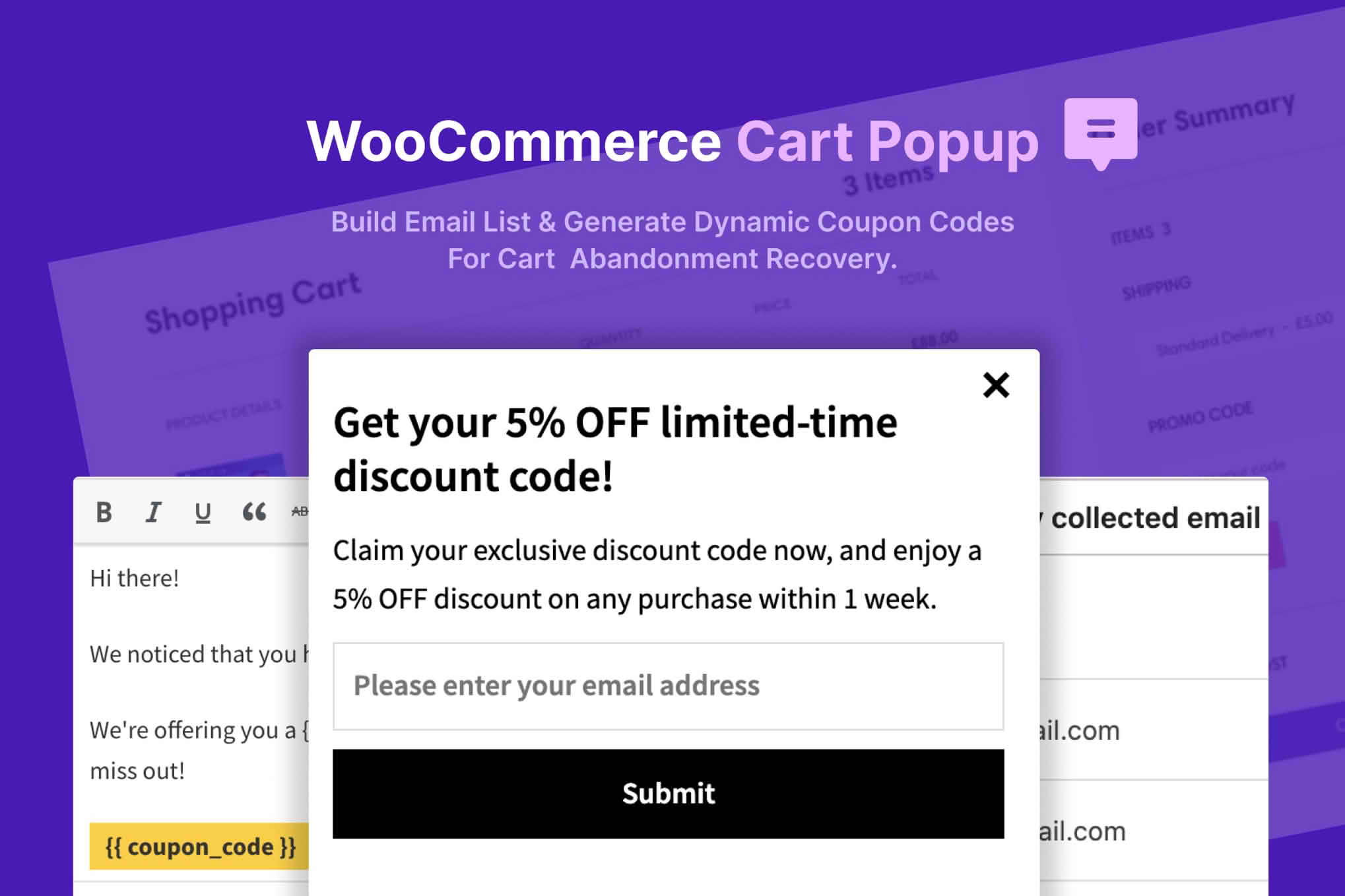
WooCommerce Cart Popup is a plugin whose title places it in the group of tools for showing a popup connected with the shopping cart on a WooCommerce store. It is intended for store owners who want to think carefully about what a shopper sees at the cart stage, and who may wish to test a message in that position. This entry describes the product’s purpose and general use; it does not list specific features. The notes below therefore cover general guidance on cart-stage popups rather than a description of any particular set of options.
A shopper who reaches the cart has already chosen one or more products and is close to a decision. Some shoppers complete the order straight away, while others leave to compare options, check delivery times or return later. Store owners often look closely at the cart page for that reason, because it is one of the last places where a short message can influence a choice before the checkout begins.
Several everyday reasons explain why carts are abandoned. Shoppers may be surprised by extra fees, may find the checkout process slow or demanding, or may simply want more time to think. These are general patterns in online retail. They describe why store owners pay attention to cart pages, and they say nothing about what any particular plugin does.
A message at the cart can take several forms. It might remind a shopper what is in the basket, explain delivery or return arrangements, point to frequently asked questions, or invite the shopper to continue to the checkout. Some stores use cart-stage messages to share a promotional offer. That approach needs care, because any offer should match the store’s own terms and be presented accurately.
The key principle is relevance. A message that tells a shopper something useful at that moment is more likely to be welcome than one that repeats a generic sales pitch. Short wording is generally better, and each message should have one clear purpose. When a message tries to do too many things, shoppers tend to skip it entirely.
A popup that appears over the cart needs a clear heading, a readable message and an obvious way to close it. The close control should be easy to find, the text should be understood in a moment, and the layout should leave the checkout button reachable once the popup is dismissed. Visual clutter, flashing elements and large areas of moving content tend to distract rather than help.
Accessibility deserves equal attention. A popup should be usable with a keyboard, its close control should be reachable without a mouse, and screen-reader users should be told that a dialog has opened. Text should have enough contrast against its background, and the content should not depend on colour alone to convey meaning. These are widely recognised practices for any overlay on a website, and they apply to a cart message as much as to a newsletter sign-up.
How often a message appears shapes how it is received. A popup that returns on every cart visit can become tiresome, while one that appears once per session may feel more considerate. Store owners often ask whether a shopper who has already seen a message should see it again, and how long to wait before showing it to the same person a second time.
Timing is equally important. A message that appears the instant a page begins to load can interrupt someone who is still reading the items in the basket. A message that appears after a short pause, once the page has settled, is generally easier to take in. Each store should test a few timing options and watch how real shoppers respond, rather than relying on a single assumption.
Many shoppers use phones, and any cart-stage message has to work on a small screen. Keep the text brief, make buttons large enough to tap with a thumb, and avoid layouts that cover the whole page in a way that is hard to leave. A popup that looks balanced on a laptop can feel cramped or unusable on a narrow screen, so testing on real devices is far more reliable than checking only in a desktop browser’s responsive mode.
Scrolling behaviour also matters on phones. If a popup locks the page behind it, the shopper should still be able to close it and return to the cart without losing their place. Confirm that the checkout button remains accessible after the popup has been dismissed, and that the list of items and the order summary stay readable.
Wording should be plain, specific and honest. A message that names a benefit should explain what the shopper must do to receive it, and any conditions should be visible in the same place. Avoid pressure phrases that imply a deadline the store does not enforce. Keeping the tone consistent with the rest of the site helps shoppers feel that the message comes from the store itself.
Stores that show a message in several languages should check each version carefully. Literal translations of short phrases can change their meaning, and a line that reads well in one language may sound awkward in another. Native-speaking reviewers can catch these issues quickly, and their feedback often improves the wording for every shopper.
Test any cart-stage message on a staging copy of the store before it reaches live customers. Walk through the full journey, from adding a product to the cart through to the checkout, and check the message at each step. Try the cart with different numbers of items, as a guest and as a logged-in customer, and in several browsers. Record the results so that the same checks can be repeated after WordPress, WooCommerce or any extension is updated.
A short list of test cases helps. One case might cover an empty cart, another a cart with a single item, and a third a cart holding many items across several categories. Each case should confirm that the message appears when intended, that it closes correctly, and that it does not block the path to checkout.
Store owners who use a cart message usually want to know whether it changes behaviour. Useful measures include the proportion of carts that become orders, the number of shoppers who close the message without acting, and any shift in average order size. Comparing a period with the message against a comparable period without it gives a clearer picture than looking at a single day’s figures.
Measurements should be read with care. Seasonal changes, marketing campaigns and product launches can all affect cart behaviour, so a change in results may have causes unrelated to the message. Writing down what else changed during the test period makes the results easier to interpret.
This entry is most relevant to WooCommerce store owners who already have steady cart traffic and want to test a cart-stage message. Agencies that manage several WooCommerce shops may find it useful for building a consistent approach across clients. Developers who need a starting point for cart-related interface work may also find the topic useful, although any custom work should be reviewed against the store’s own requirements.
Stores with very low cart volume may find it hard to measure any effect, because small numbers can swing widely from week to week. Such stores may prefer to gather more data over a longer period before drawing conclusions, and to focus first on making the cart and checkout pages clear and quick to use.
Cart-stage messages often sit alongside other parts of a store, including email reminders, shipping calculators, checkout plugins and analytics tools. Before adding a popup, check that it does not conflict with those tools and that the cart and checkout pages still load quickly. Keep a list of active plugins so that conflicts can be traced to their source when they occur.
Caching is a common source of confusion. A cached page may show an old version of a message, or may hide a message from a shopper who should see it. Clearing the cache after a change, and testing with the cache active, will show whether the message behaves correctly for real visitors.
Any cart-stage message needs periodic review. Wording that was relevant during one season may be out of date later, and a message that performed well may stop performing as the audience changes. Schedule a regular check of the message content, the timing settings and the test results, and remove any message that is no longer useful.
WooCommerce Cart Popup is aimed at WooCommerce stores that want a popup connected with the cart. Used carefully, a short and well-timed message can help a shopper move toward checkout, while a poorly designed one can frustrate people at the point where they are closest to buying. Testing on a staging copy, attention to accessibility and mobile layouts, and clear measurement are the practices that make the largest difference. This entry describes the product’s purpose and general use and does not list specific features.


