

Updates for one year, unlimited sites, auto updates, and regular updates.
$3.99
 BookmarkBookmarked
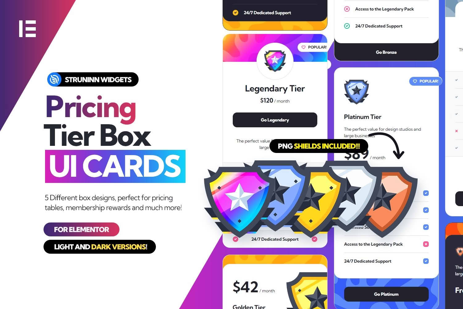
This Elementor add-on provides table-style and card-style widgets for presenting tiered options on a WordPress site. Its tags include tier and badge, which point to the intended use. The vendor’s description is short, so this overview concentrates on the points the listing and documentation confirm, with general guidance on laying out tier comparisons in a page builder.
The listing describes the product as a way to add table and card widgets to Elementor. Once the product is installed, the widgets become available in the Elementor editor, where you can drag them onto a page and start customising them. The tags tier and badge, together with the table wording in the listing, suggest comparison layouts in which several levels are presented together. The listing does not explain what a badge looks like or how it is applied.
Typical uses for a tier layout include membership levels for a community site, service levels for a consultancy, and access levels for a course or a members-only content library. Those examples describe the kind of content such layouts usually carry; they are not features the vendor has promised for this product.
The documentation names three routes for displaying the widgets, and the vendor’s other card products use the same three. The first is the Elementor editor, where the widgets are inserted into pages like any other Elementor element. The second is WordPress shortcodes, which can display the widgets within posts and pages. The third is template functions, where each widget template has a function that returns its HTML and arguments can change that output.
The documentation marks the template-function route as one that requires developer knowledge. Designers who build pages in Elementor will normally stay with the widgets, while a developer who wants the markup inside a custom template can use the functions. Shortcodes fall between the two in terms of effort, since they need only a short tag and no custom template code.
A tier layout is most useful when a visitor has to choose between related options. Membership clubs, consultancies, training providers and content libraries often present their options this way, because visitors can compare the levels without reading long paragraphs. The tags on the listing point towards this kind of site, and the product name suggests that comparison is its main job.
Designers and site builders who already work in Elementor will probably use the widgets most often, since they fit the normal page-building workflow. Developers who maintain custom themes can reach the same output through functions, which keeps the markup under their control. Either way, a tier layout only works when the tiers are described clearly, so the content matters as much as the widget.
Start by deciding how many tiers you need and what separates one from the next. A comparison reads most clearly when each tier has the same structure, so settle the order of information first and then fill every tier in the same way. This is general planning advice rather than a feature of the product, but it is the step that most often decides whether a comparison is easy to read.
Test each layout on a phone as well as on a desktop screen. Comparison layouts often stack into a long column on a small device, and visitors then have to scroll back and forth to compare the options. Check the stacked version, make sure the tier names stay easy to find, and keep the wording in each box short and specific rather than long blocks of text.
Think about where the comparison sits on the page. A tier layout placed after a short explanation of who each level suits gives visitors context before they compare, whereas a layout at the very top may ask them to decide before they understand the options. Put a clear heading above the comparison so that anyone scanning the page can see what it contains.
Use consistent names for the tiers across the whole site. If one page calls a level “Gold” and another calls the same level “Advanced”, visitors will struggle to follow the comparison. Choose names that describe the level rather than the audience, and keep the same names in menus, emails and support material.
If you want to highlight one tier, decide how it will stand out before you build the page. A label, a different background or a larger box are common choices, but the listing does not describe how the badge or any other emphasis is set up. Confirm that the product supports your chosen approach on a test page before planning around it.
The documentation says that Elementor is required, and the listing says the product is compatible with Elementor without giving a version number. The software version shown on the listing is WordPress 6.5.x, and the browsers named are Firefox and Chrome. The listing also marks the product as not optimised for the Gutenberg block editor, so anyone who plans to place the shortcodes in block-editor content should test them there first.
The listing’s most recent update is dated July 2024. That date is worth checking against the WordPress and Elementor versions on your own site. Install the product on a staging copy, confirm that the tier widgets load without errors, and check the front end in the browsers your visitors are most likely to use.
The listing notes that the package includes PHP, JavaScript and CSS files. Check that all of them load cleanly on the staging copy, because a blocked script or stylesheet can stop a tier layout from appearing as intended.
Several details are missing from the public listing and documentation. The vendor does not list the content fields available in each tier box, such as titles, feature lists, buttons or badges. It does not say how many layouts exist, and it does not describe colour, typography, spacing or hover options. Separate documentation pages cover template functions, shortcodes and Elementor widgets, and those pages should be read for the details this overview leaves out.
Where a feature matters to your project, check the live preview and screenshots linked from the listing, then build a test page before you plan the rest of the site around it.
A comparison works when its rows are chosen with care. List the points on which the tiers genuinely differ, remove anything that appears in every tier, and order the remaining points from most to least important to the visitor. A short list of rows is easier to scan than a long one, and it leaves room for the wording that explains each difference.
Plain language helps more than clever phrasing. Visitors compare tiers quickly, often on a phone, so each row should say exactly what it means. If a term needs explaining, add a short sentence beneath the comparison rather than burying the explanation inside a box. Ask someone who has not seen the site before to read the wording, because they will quickly show where the text is unclear.
Use real heading levels for the page and keep them in a sensible order, so that screen readers and search tools can follow its structure. Make sure each tier name is clear without relying on colour alone, because visitors who cannot distinguish certain colours still need to understand the comparison. Test the page with the browser zoomed to a larger size, since text that fits at normal size can overflow its box when enlarged.
The listing does not describe accessibility features for the tier widgets, so these checks fall to the site owner. Review the keyboard path through the page, confirm that any link or button inside a tier box can be reached without a mouse, and check the contrast of text against each background. Small adjustments made at this stage are much easier than changes made after visitors have already reported problems.
Comparison pages go out of date quickly if nobody reviews them. When a level changes, update every page that mentions it, including menus, emails and support articles, and note the date of the change so that colleagues can see when the comparison was last checked. A simple review schedule, such as a quarterly check, helps stop the page drifting away from the rest of the site.
Software updates deserve the same discipline. After updating WordPress or Elementor, look at each comparison page on desktop and mobile, confirm that the tier layout still renders as intended, and check each shortcode placement you rely on. This habit takes only a few minutes and protects the pages that visitors depend on most.


