

Updates for one year, unlimited sites, auto updates, and regular updates.
$3.99
 BookmarkBookmarked
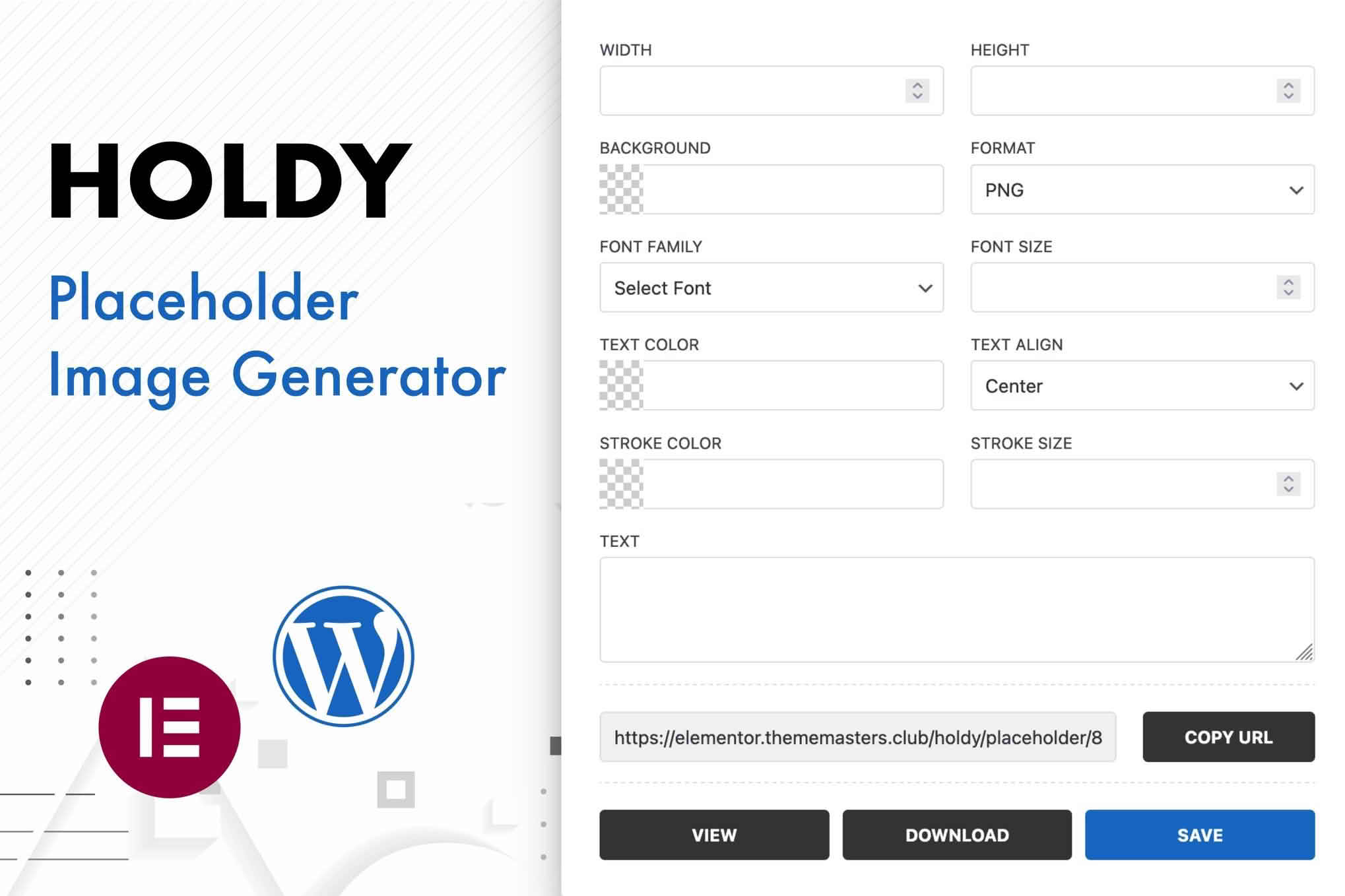
Holdy generates placeholder images on the fly while you design, so a layout can take shape before the final photography arrives. It also adds Elementor widgets for quick mock-ups, which means clients, colleagues and developers can review a realistic page instead of an abstract sketch. Together, those two features keep a design moving at the stage when images are usually the bottleneck.
A page without images is hard to judge. Spacing, hierarchy and rhythm all depend on how large the visual areas are and where they fall in relation to the text. Placeholder images hold the space that a final image will eventually occupy, so the design can be assessed on its own merits rather than on the accident of which stock photos happened to be available. Reviewers also tend to give more useful feedback when the page looks like a page.
The central idea is speed. Rather than stopping to hunt for a suitable image, you can generate a placeholder at the moment the layout needs it and carry on working. That keeps momentum in the design process and avoids the common situation in which a whole page waits for assets that are still in production. Designers can test several arrangements in a single session, moving blocks around and judging each one with image-sized areas in place.
The Elementor widgets make mock-ups quicker to assemble inside the page builder. A mock-up built this way lets you show a client how a homepage, landing page or product section will feel before a single final image has been commissioned. Because the mock-up is built in Elementor, its structure can carry over to the live page instead of being rebuilt from scratch. That continuity saves effort and keeps the review focused on the design itself.
Image proportions shape many layout decisions. A wide banner, a square product tile and a tall portrait each place different demands on the text around them. Deciding those proportions early tells the photographer or designer what to capture, and it prevents crops from cutting off important subjects later. Writing the intended size beside each placeholder in a shared document helps everyone work from the same plan.
Early concept work can tolerate rough areas, because the goal at that stage is to test the broad shape of a page rather than the finished look. As a project nears review, the placeholders deserve more attention. Their proportions should match the final photography brief, and their position should reflect real captions and headings. Near launch, placeholders should be almost indistinguishable in size from the images that will replace them, so that the last round of checks reflects the true page.
Columns that sit side by side on a desktop often stack on a phone, which changes how much room each image receives. Check mock-ups at several widths before you call a layout final. Placeholders that look balanced on a wide screen can dominate a narrow one, pushing the copy far down the page. A short review on a phone-sized view reveals these issues quickly, while they are still simple to fix.
Text sitting beside a large image needs room to breathe. Keep line lengths comfortable, usually somewhere between forty and seventy characters, and leave enough white space between a text block and the edge of the image so the two do not compete. Captions should be smaller than body copy but still legible, and they should sit close to the image they describe. Placeholders can make these relationships look better or worse, so adjust the text blocks while the image areas are still stand-ins.
Many layouts place text over an image, which makes contrast the most important check. A neutral placeholder area can help you judge whether a headline remains readable, but the test is only valid if the final image will have a similar tone. Before you accept an overlay, compare the text against the darkest and lightest parts of the photograph you expect to use, and adjust the overlay strength or text color if either extreme fails. Revisit the check once the real image arrives, because a subject that looked neutral in the photograph may cover the headline.
Placeholders are easy to mistake for finished content when nobody has labeled them. Tell reviewers which areas are temporary, and keep a running list of the images still needed, with the page and the intended proportions beside each entry. Agree in advance on what a placeholder may look like in a review round, so feedback concentrates on layout and messaging rather than on the stand-in visuals.
A mock-up is most useful when it hands over clear information. Record the intended dimensions, the aspect ratio, the file format and the naming convention for each image, and attach them to the relevant page section. Note which areas must stay responsive and which can be cropped by the theme. Developers can then replace placeholders with final assets without guessing, and the page keeps the structure your reviewers approved.
Before a site goes live, locate every placeholder on every page and swap in the final image. Confirm that each replacement matches the proportions you planned, compress the file so the page stays fast, and check the result at mobile widths. A final pass across the whole site catches stragglers that appear only in templates, sidebars or archive pages, where they are easy to miss during a page-by-page review.
Alt text is a short description that tells screen reader users and search engines what an image shows or why it is there. Informative images need alt text that describes their purpose on the page. Purely decorative images should carry empty alt text so assistive technology can skip them. Generic placeholder labels should never survive into the published site, because they give visitors who rely on screen readers nothing useful.
The most frequent problem is a placeholder that reaches the live site. A close second is a set of identical placeholders that makes every section look the same and confuses reviewers about what is what. Teams also forget alt text, ignore the mobile layout until the final week, or add large final images without checking how they affect loading time. Each mistake is easy to prevent with a short checklist that the team reviews before each release.
Mock-ups travel through several hands before launch, so a clear process matters. Share one link or one document that holds the current state of each page, and record decisions as they are made rather than leaving them in a long email thread. Keep versions of the page files, so you can return to an earlier state if a review round goes in the wrong direction. A dependable handover depends on that discipline, and it turns placeholder work into a smooth transition rather than a last-minute scramble.
Consistency matters most when several designers share one project. Agree on a small set of proportions for each template, such as one shape for hero areas and another for cards, so that the placeholders read as a system rather than a collection of one-off guesses. Name placeholder areas by their template role instead of their page, which makes them easier to find during replacement. When a proportion changes late in a project, revise the shared plan first and then the pages that use it, so the whole site moves together.
A mock-up can look finished long before the content behind it is settled. Say clearly which parts are provisional, including the copy, the imagery and any data shown in lists or charts. That candor protects the schedule, because a reviewer who approves a page on the strength of a placeholder may later be surprised by a final image that behaves differently. Presenting the stand-ins as stand-ins keeps expectations realistic from the first meeting onward.
Designers working on WordPress sites will find the placeholder workflow useful for early presentations. Agencies can use it to show several directions to a client in a single meeting. Freelancers benefit when a project depends on assets that the client has not yet supplied. Developers building page templates can work on structure while copywriters and photographers finish their parts. Content teams drafting landing pages can also use placeholders to test messaging before any imagery is commissioned.
Holdy keeps the design process moving by supplying placeholder images when the layout needs them, and its Elementor widgets help turn those placeholders into quick, realistic mock-ups that the whole project can review.


