

Updates for one year, unlimited sites, auto updates, and regular updates.
$3.99
 BookmarkBookmarked
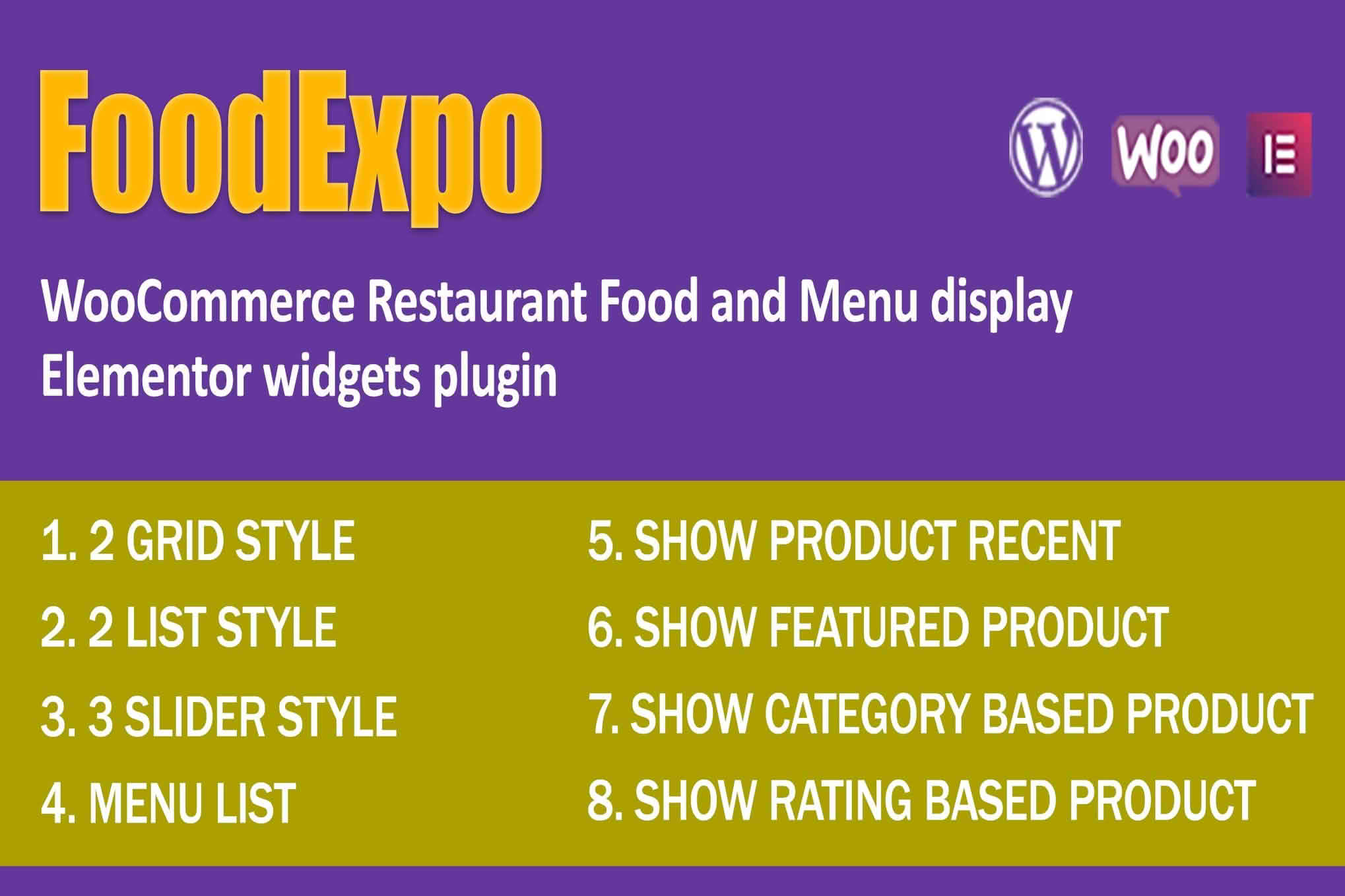
FoodExpo is a set of Elementor widgets designed for presenting restaurant food menus on WooCommerce sites. It suits restaurants, cafes, takeout counters and other food businesses that want the menu on their website to look as appetizing as the food itself. Dishes, their categories and the amount beside each dish can be displayed in attractive layouts, and those layouts are meant to let customers browse and choose what they would like to order.
Because the menu runs on WooCommerce, each dish lives within the same product system a retail store uses. That gives a restaurant a single place to manage dish names, descriptions, images and the categories that group them. The Elementor widgets then handle presentation, so the same menu can sit on the home page, on a dedicated menu page or inside a seasonal campaign page without rebuilding the dish information each time.
This arrangement suits businesses that already sell online. A cafe, a takeout service or a catering company can keep one list of dishes rather than maintaining a printed menu and a separate web page that drift out of step. A single change to a dish, such as a new description or a revised amount, is far simpler than a series of edits across different documents.
Good menus start with a sketch on paper. Sketch the sections in the order a diner would want to read them, and decide how many dishes each section should hold. A menu with fifteen starters and three desserts is harder to scan than one with a balanced spread, so think about proportion as well as variety. List the items that stay on every version of the menu, then note the ones that rotate. This sketch becomes the blueprint for your categories, and it keeps the site tidy when the menu grows.
A menu is easiest to read when dishes sit in clear categories such as starters, main courses, desserts, drinks and specials. Each category needs a short, obvious name, because visitors often scan the headings before reading a single dish description. Within a category, every dish should carry a recognizable name, a sentence or two of description and a clear amount.
Amounts deserve consistent formatting. Decide how currency symbols will be shown, whether you will use two decimal places, and how you will mark a dish that comes in several sizes. Consistency matters more than any single choice, because mixed formats make a menu look careless even when the food is excellent.
Menus succeed visually when they combine generous spacing with a small number of typefaces and a restrained color palette. Photography carries much of the appeal, so use images with consistent lighting and crop them to the same proportions. Where a dish has no photograph, a clean text entry is preferable to a mismatched stock picture.
Layouts should follow the menu’s purpose. A long full menu benefits from clear section breaks and room to read each description. A short lunch menu can use a compact grid with bold imagery, because the visitor needs to decide quickly. A set menu for an event can use a single column that reads like a printed card. Test every layout on a phone, since many diners will open the menu on a small screen while they decide where to eat.
Professional photography is not always affordable, but a well-lit phone picture can still do the job. Shoot near a window in daylight, avoid the flash, and keep the camera level with the plate at a steady angle. A plain table or a neutral backdrop keeps attention on the food. Take the same shot for every dish so the grid of images looks consistent, and resize the pictures before uploading them so the menu page stays quick to load on mobile connections.
A menu that invites ordering answers three questions quickly: what is available, what each dish costs and how to choose. The first is answered by clear categories and short descriptions. The second needs consistent figures and no confusing extras. The third depends on how obvious the next step is, so each dish should look selectable and the surrounding text should make the next action clear.
Readability matters for every diner. Dark text on a light background is easier to read than pale grey lettering, and dish names should stand out from their descriptions through weight or size rather than color alone. Many people reading a menu are using reading glasses or a small phone screen, so generous line spacing is a kindness rather than a luxury.
Dietary information helps many diners. Vegetarian dishes, vegan dishes, spicy dishes and those prepared without gluten can carry a consistent symbol, with a key explaining the symbols at the top of the menu. Allergen details are the restaurant’s responsibility to confirm with its own suppliers and procedures, so present that information carefully and accurately.
A good description says what the dish is and how it is prepared without overstating it. Name the main ingredients, mention the cooking method when it adds interest, and keep the sentence short enough to read at a glance. Avoid the vague superlatives that every menu uses, because specific details are more convincing. A slow-braised beef dish, for example, reads better when the description names the cut and the accompaniment than when it simply calls the dish delicious.
A menu does not have to live on a single page. The home page can feature a short selection of signature dishes, a dedicated menu page can hold the full list, and a seasonal campaign page can highlight limited-time items. Because the dishes are stored once, a change should carry through to every place the menu appears, which keeps the site consistent.
Think about the menu’s place in the rest of the site as well. Navigation labels should be specific, such as Menu or Lunch Menu, and the page should load quickly on mobile connections. Keep images reasonably sized, and place the most important dishes near the top so visitors do not need to scroll past everything to find them.
Many restaurants now show a menu in more than one place. A QR code on a table card can open the same web menu that appears on the website, so guests and online visitors see identical information. Keep the physical card and the web page aligned, and when a dish changes, check both. Printed and digital menus that disagree are one of the quickest ways to lose a guest’s trust.
Seasonal dishes need a clear life cycle. Decide in advance when a special goes live, when it comes off the menu and what replaces it. Keep the outgoing dish in your records rather than deleting it, because it can return next year with a fresh photograph and a revised description. If a special is limited by ingredients rather than by date, hide it as soon as the kitchen runs out, so visitors are never disappointed by a dish that cannot be made.
A menu is only useful when it reflects what the kitchen can serve today. Remove dishes that are no longer available, or hide them until they return. Review amounts whenever ingredients or supplier costs change. Seasonal items should be retired on schedule, so a visitor never orders something the kitchen has stopped making.
It helps to give one person ownership of the menu. That person checks the list each week, confirms that photographs still match the plates and reads the page on a phone to make sure a recent edit has not broken anything. A small routine like this catches many of the problems that frustrate diners.
Restaurants with a permanent menu can use the widgets to replace a static document. Cafes that change their offer often can keep the menu fresh with little effort. Takeout businesses and food trucks can present a compact menu that customers check before they call or visit. Caterers can publish set menus for each package, and businesses with several dining spaces can use separate categories or pages to keep each offer distinct.


