

Updates for one year, unlimited sites, auto updates, and regular updates.
$3.99
 BookmarkBookmarked
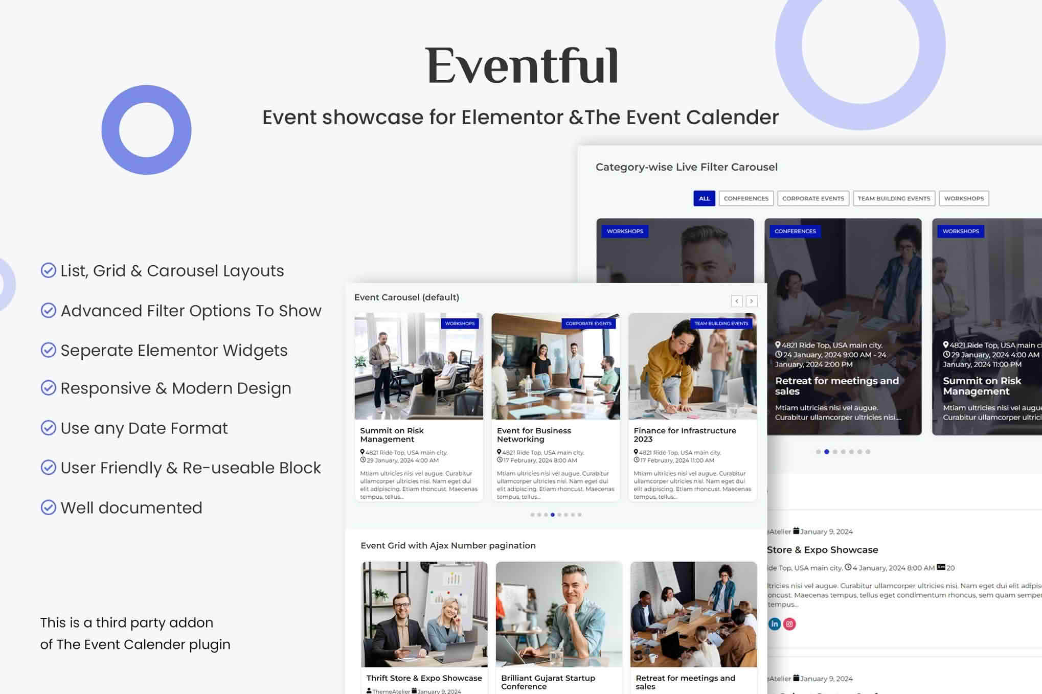
Events Showcase For Elementor And The Events Calendar adds a set of visual event widgets to the Elementor editor, so the events stored in The Events Calendar can be presented in layouts that match the rest of your site. Instead of assembling listings by hand, you place a widget on the page, choose the events to display, and arrange them as a grid, a carousel, a slider, a compact list or a vertical timeline. Every widget can be styled in detail, which suits designers who care about the finer points of an events section. No coding is needed to get started.
When the plugin and The Events Calendar are both active, five event widgets appear alongside the other Elementor elements. Each one can be switched on or off from the plugin’s admin area, which keeps the editor tidy on sites that only need a couple of layouts. The widgets are built inside Elementor and show a live preview while you work, so changes to spacing, color and text are visible before you publish the page.
The Grid widget arranges events in a multi-column layout. Spacing between columns and between rows can be set independently, and you can start from a custom layout or choose one of three prebuilt templates.
The Carousel widget presents events as a swipeable strip built on Swiper.js. The number of columns and rows can change with the screen size, and visitors can move through the items with arrows, dot navigation, touch swipes or mouse dragging. Autoplay is available for sites that want the strip to advance on its own.
The Slider widget places one event on each slide and lets the image span the full width of the slide. It suits a hero area or a featured banner, where a single upcoming event should command the most attention on the page.
The Minimal List widget shows each event as a compact row, with the picture on one side and the details on the other. Like the grid, it can use a custom layout or one of three prebuilt templates, which makes it a practical choice for parts of a page where space is limited.
The Timeline widget alternates events from one side of a central line to the other, and the line fills in as the visitor scrolls. Optional month and year dividers can separate groups of events, and the color and weight of the line, the dots and the date badges can all be adjusted. It works well for a run of workshops, a series of lectures or a season of performances.
Each widget can show the newest events, or only those flagged as featured inside The Events Calendar. Results can be limited to upcoming events, optionally judged by start date, and particular events can be included or excluded by hand. Several kinds of event can be excluded, including the event that is currently running, password-protected events and events without an image.
Results can be sorted by ID, title, start date, slug or at random, in ascending or descending order. A maximum number of events can also be set, which keeps longer sections compact and easier to scan.
The filter system runs through AJAX, so results change in place while the visitor stays on the same page. Category and tag filters can be combined with IN, AND or NOT IN logic, and the rows of filters can be joined with either AND or OR. Filter choices can appear as tab-style buttons that show how many events each one matches. Empty tabs can be hidden, the All tab can be relabeled, and icons and alignment can be adjusted.
A keyword search box sits alongside these filters and can be given its own label, placeholder text, width and text alignment. A reset button clears every active filter at once. For longer lists, a Load More button fetches the next group of events and can show a custom message once nothing else remains to load.
Each event card is assembled from separate parts: the thumbnail, the title, meta information, body text and share buttons. These parts can be dragged into a different order or hidden individually. The featured image can be removed entirely, and images can use any WordPress image size, with high-density output for sharper screens. An optional overlay can display the category or the date on top of the picture.
Meta fields are configured one at a time. The category can appear with an icon, and the venue block can show the address, city, state, country, postal code and phone number, with an optional Google Maps link. The organizer name can appear beside a chosen icon. Event time can show only the start, only the end or the full range, using either a preset format or a custom PHP date format.
The title can be hidden or rendered as any heading level from H1 to H6, or as a div, span or paragraph. It can be limited to a character count and aligned as needed. Body text can show the full content, an excerpt, or a shorter version cut by words or characters, with control over HTML stripping and the ellipsis wording. The Read More link can appear as a button or as plain text with an editable label. Share buttons cover Facebook, Twitter, LinkedIn, Email and WhatsApp. Links can point to the event page or be turned off, and the link target and an optional nofollow attribute can be chosen.
Every element has its own style panel, covering titles, boxes, images, meta text, labels, body text, buttons, the filter bar, pagination and carousel navigation. Ready-made designs can be applied with one click, and each layout can use a separate color scheme for featured events compared with other events. The date strip can have a solid background or a gradient.
Theme developers can override the plugin’s templates from within a theme, and a right-to-left stylesheet loads automatically for right-to-left languages. The bundled libraries carry unique names, which makes them less likely to conflict with other scripts on the same site.
Autoplay has an adjustable speed and can pause while the visitor hovers over the content. Infinite looping, lazy loading and a choice between left-to-right and right-to-left direction are available. Columns, rows and the number of slides moved per step are set separately for five screen sizes, from large desktop displays down to phones. Arrows and dot navigation can be shown, and arrows can be made visible on mobile devices too. The height of the carousel adjusts to its content, and keyboard navigation works alongside mouse and touch input.
On touch screens visitors can swipe through the items, on desktops they can drag with a mouse, and mouse-wheel scrolling also works. Most visitors already expect these gestures from a modern slider, so the controls feel familiar.
The plugin needs WordPress 6.0 or newer and PHP 7.4 or newer. It works with Elementor 3.5.0 and later. The Events Calendar must be installed and active, since it is the only event plugin the widgets are built for, and the base edition of that plugin is enough. Because the widgets read from The Events Calendar, keeping those event records complete tends to make every layout look better.
To begin, install and activate The Events Calendar and this plugin, open any page in the Elementor editor, and search the widget panel for the event widgets. Drag the one you want into position, choose your events, and refine the design from the style tabs.
Elementor designers can build event sections visually, which saves time on projects where layout matters as much as content. Event managers who list conferences, concerts, classes and similar gatherings can let visitors narrow results by category, tag or keyword. Web developers can place an events widget quickly and then adjust the templates to match a theme. Schools and universities can present campus activities and open days on a timeline or in a plain list, while nonprofits and community groups can promote fundraisers, volunteer roles and local get-togethers in a grid.
The best widget depends on the job the section has to do. A slider or carousel suits a homepage where visitors should skim a few highlights. A grid works for an events archive where people compare many listings at once. A minimal list fits a narrow column or a footer. A timeline tells a story across dates, which makes it a natural fit for a festival program or a course schedule. Because each widget is configured separately, the same events can appear in different forms on different pages.
An events section is only as good as the records behind it. Short, specific titles read better in cards, and a featured image makes image-based layouts far more appealing. Category and tag names deserve some planning, because the filter bar depends on them. Complete dates and times matter as well, since the time display options draw on that information.
Check the section on phones as well as on desktop screens. Elementor’s responsive preview modes make this straightforward, and carousel columns can change with screen size, so a row of four cards that looks balanced on a large monitor may need to become one or two columns on a phone. When a list grows long, use the Load More button or a result cap to keep the page manageable.


