

Updates for one year, unlimited sites, auto updates, and regular updates.
$3.99
 BookmarkBookmarked
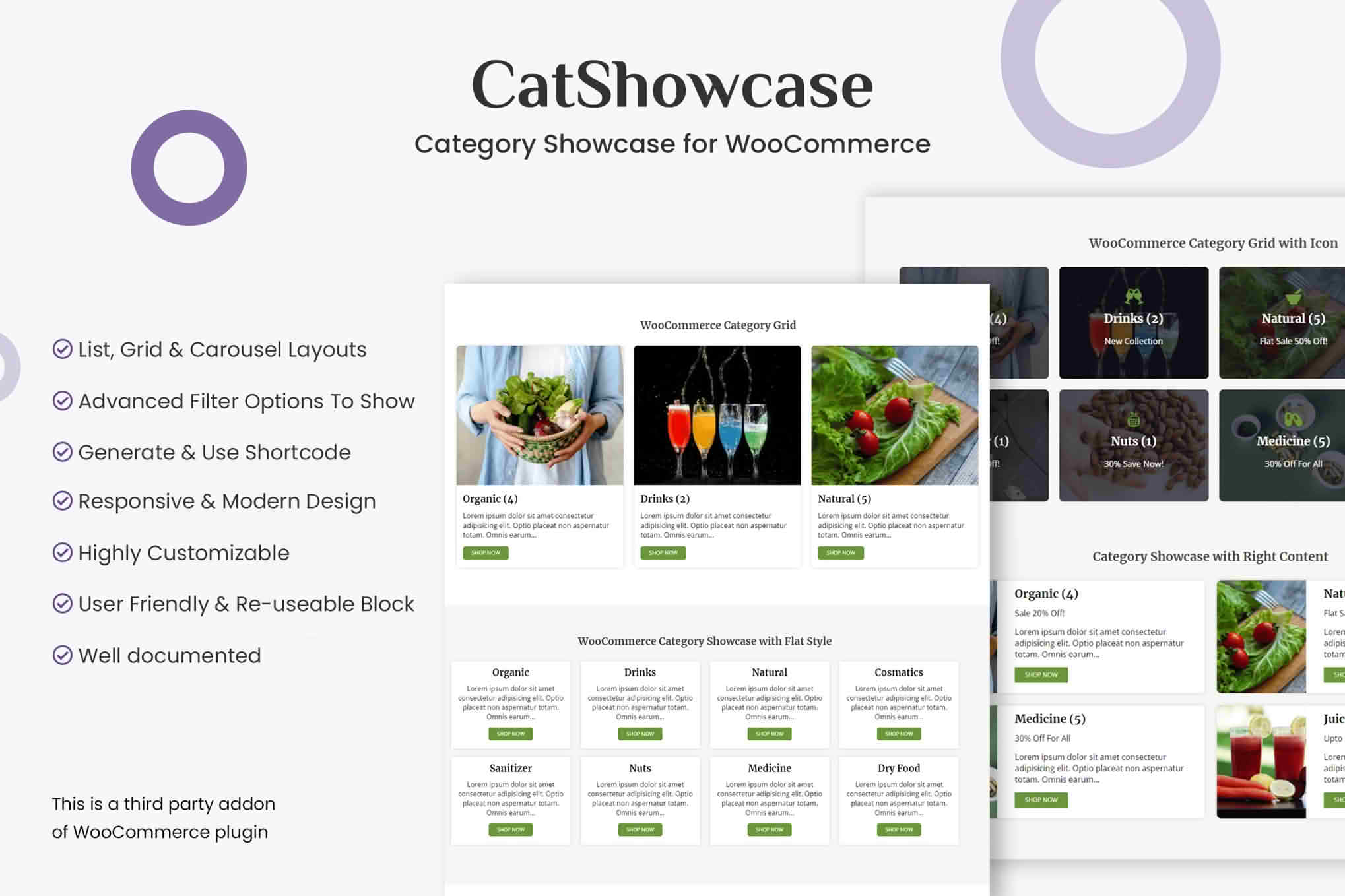
Categories are the signposts of a WooCommerce store, yet they sometimes sit in a menu that visitors rarely open. CatShowcase brings your categories forward as a visual showcase, presenting them in grids, carousels, and other attractive layouts. The result is a clear route into the right section of your store, so customers can find what they came for without digging through navigation panels.
When a store has dozens of categories, visitors can feel lost before they have seen a single product. A showcase works as a visual index. Every category in the display can carry its own thumbnail image, which gives shoppers a quick preview of the range before they commit to a click. That small step reduces guesswork, shortens the time spent browsing, and encourages people to explore sections they might otherwise overlook.
Because the showcase can be inserted with a shortcode, you can place it on the homepage, on a landing page, or on any other page where a guided set of categories makes sense. Use it to direct attention toward the departments you most want shoppers to explore, and keep the rest of the store reachable through your usual menus.
CatShowcase presents categories in a slider-style arrangement that behaves much like a carousel. Grid and list presentations are also available, so when you set up the showcase, compare the options to see which suits your theme and product range best.
Choosing a layout depends on how many categories you have and how visually rich they are. A carousel suits a store with many departments, because it lets visitors move through them without pushing the rest of the page far down. A grid can work well when each category has a strong image and a short name. A list may be better for stores with plain, text-led navigation.
Each category can display a thumbnail image, and that picture does much of the persuasive work. Choose images that represent the category honestly and share a consistent style, so the showcase feels cohesive. Pictures that are too cropped or too busy can make category names harder to read, so test a few options before committing.
Image consistency matters in both grid and slider views. Where possible, use pictures with a shared background and similar lighting, so the eye moves smoothly from one category to the next. If your store uses lifestyle photography for some departments and plain product shots for others, consider standardising the approach so the showcase feels deliberate.
Category descriptions are optional. A short line beneath a category name can clarify what a department contains, such as the types of products it holds or the occasions it suits. Keep descriptions brief, because a showcase is meant to be scanned quickly. If a category needs a longer explanation, link to its archive page instead of filling the card with text.
The optional Shop Now button gives visitors a clear next step. Use it where a category is ready for immediate browsing, and consider leaving it off in places where the image already makes the destination obvious.
You do not have to display every category. CatShowcase lets you select the categories that appear in the showcase, so attention goes to the parts of the store that matter most at a given time. This is useful for seasonal campaigns, for hiding categories that are temporarily unavailable, and for keeping the showcase tidy as your catalogue evolves.
Subcategories can be included as well. For stores with deeper hierarchies, this helps shoppers reach specific corners of the catalogue straight from the showcase. Consider whether a subcategory deserves its own visual slot or whether it is better represented through its parent. Too many entries can dilute the impact of the showcase, so a restrained selection usually works best.
Category archive pages introduce a small wrinkle. When a visitor is already browsing one category, showing that same category in the showcase can feel redundant. CatShowcase includes an option to hide the active category in archive views, a feature added in version 1.0.1. Enabling it keeps the showcase focused on the alternatives a visitor might want next.
CatShowcase includes a shortcode generator aimed at people who do not write code. It lets you assemble the shortcode through the plugin rather than typing it by hand. Paste the result into the page or post where the showcase should appear, and it will show up there when the page loads.
CatShowcase is optimised for the Gutenberg block editor. If most of your pages are built in the native WordPress editor, you can place the showcase within those pages and keep your editing routine simple. If you use another page builder, check how the showcase behaves there before committing to it.
A showcase should look like it belongs on your site. Compare it with your existing product grids and menus to check that the overall look stays consistent. Where the styling feels out of step, adjust the surrounding section rather than accepting an awkward fit. Previewing the page at several screen sizes will show whether the section sits comfortably with the rest of the design.
Compatibility covers a range of WooCommerce and WordPress versions, along with several major browsers. Confirm that your store falls within those ranges before you install, and keep a staging copy available so you can test updates before they reach customers. Version ranges change over time, so review them again whenever your store is upgraded.
Readable category names matter more than decoration. Make sure the text stays legible over every thumbnail, keep the contrast between labels and backgrounds strong, and avoid busy motion that could distract readers. Descriptive alternative text on each category image helps screen reader users understand the section, and it gives search engines useful context about your categories. Clarity serves every shopper, not only those with specific access needs.
Stores with a wide catalogue usually see the biggest benefit. Fashion retailers with separate lines for footwear, outerwear, and accessories, or hardware suppliers with dozens of tool families, can find that customers struggle to locate the right section. A visual entry point makes those larger ranges feel manageable. Smaller shops can benefit as well, particularly when a handful of well-chosen categories helps a first-time visitor see what the business offers at a glance.
A few errors appear often in category showcases. Showing too many categories at once can overwhelm visitors, so start with a focused selection. Mismatched thumbnails make the section look unfinished, even when the categories themselves are strong. Vague names are another trap, because a showcase only works when a shopper can predict what lies behind each card. Finally, forgetting to refresh the showcase after a catalogue change can send visitors into sections that look promising but contain little stock.
A showcase is only persuasive when it matches what the store currently sells. Review it whenever you add, rename, or retire a category. Remove categories that no longer hold products, because an empty destination disappoints the visitor who clicked on it. Likewise, refresh thumbnails that show discontinued items, so the showcase keeps reflecting your current range.
Before you configure the showcase, spend time with your category structure. Overlapping categories will look muddled in any layout. Clean up duplicates, merge categories that shoppers never distinguish, and give each remaining category a clear name. A tidy structure makes the showcase far more effective.
Next, choose the imagery. Consistent photography or illustrations give the showcase a professional look. Crop images to matching proportions where possible, check that each one still reads well at a small size, and replace out-of-date pictures as your range changes. Visitors judge a store quickly, and the showcase may be the first place they see its range.
Finally, measure what happens. Track which categories attract clicks, which ones visitors skip, and whether the showcase changes how people move through the store. Use those patterns to adjust the selection, the layout, and the order over time, rather than treating the showcase as a one-off decoration.


