

Updates for one year, unlimited sites, auto updates, and regular updates.
$3.99
 BookmarkBookmarked
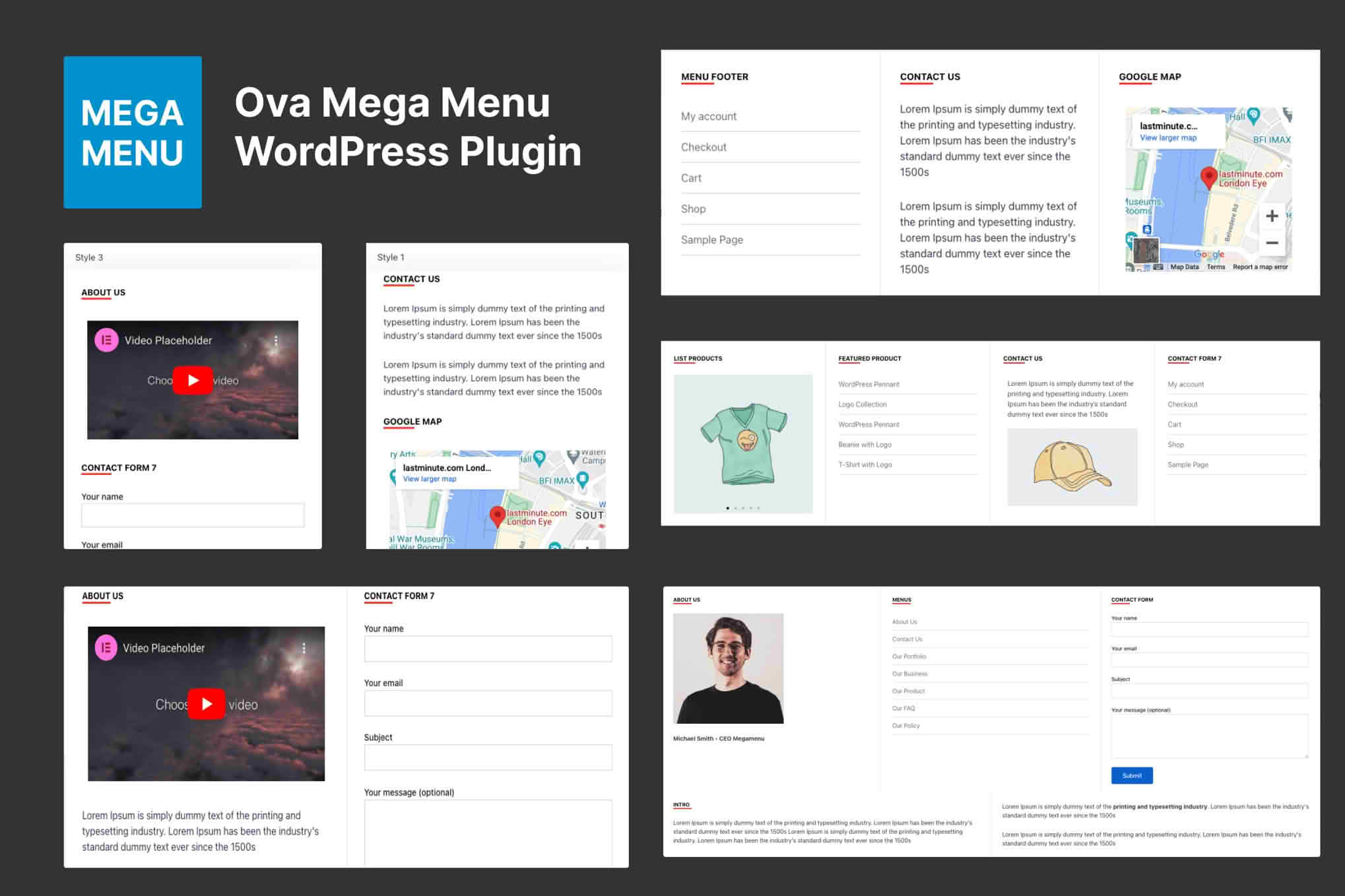
A standard navigation menu handles a handful of links well, but a store or magazine with dozens of categories needs more room to present them clearly. Drag & Drop Menu Builder – Ova Mega Menu lets you build mega menus, which are dropdown panels that open from a menu item and hold several columns of content. You design each panel visually by dragging content into rows and columns, then attach the finished panel to a menu item. The result is a navigation that can show text, images, existing menus and widgets without writing code.
Mega menus are created in their own admin panel, separate from the regular menu screens. Each panel is built from rows, and every row is divided into columns. You can adjust the size of rows and columns, with widths expressed as percentages, which makes it easy to split a panel into halves, thirds or uneven layouts. Content goes into a column by dragging it into place, so you can arrange a panel by eye rather than by entering coordinates.
Working with rows and columns also keeps complex panels manageable. A panel that carries a featured block, a set of category links and a short paragraph can be treated as three separate units rather than one tangle of elements. Each unit can then be styled and adjusted on its own, which helps when the panel grows over time.
The content widgets documented for the plugin include a visual text editor, headings, shortcodes and existing navigation menus. Elementor templates can also be placed inside a column, which is useful if your site already has designed sections built in Elementor. Images can be arranged in the same way, so a single panel can combine a featured picture with links and a short paragraph. Menu entries can also be created by hand when you need a link that does not already exist in one of your menus.
Mixing content types lets each panel do a specific job. A product panel might lead with an image and a heading, then list the most popular subcategories beneath it. A content panel might pair a short introduction with links to recent articles. Because each column is an independent unit, you can rearrange the content without rebuilding the whole panel.
Existing navigation menus can be inserted into a column, so a category list you already maintain can appear inside a mega panel without being retyped. Shortcodes can also be placed in a column, which extends the panel to any output that a shortcode can produce. When the panel is complete, the builder generates a shortcode for it. Adding that shortcode to a menu item attaches the mega menu to that item, so the panel opens from the link you chose.
Inserting an existing menu saves time when a store has a long list of links that would otherwise need to be typed again. The panel stays a single unit, so you can still place other content alongside the inserted links to build a richer layout.
Each mega menu can have a separate layout for desktop, tablet and mobile. The builder provides a tab for each device, so you can rearrange columns for a smaller screen without changing the desktop version. Breakpoints are user-defined and can be set separately for each device, which gives you control over the point at which a layout changes. That matters because a panel that looks balanced across a wide monitor may need fewer columns on a phone.
A panel can open when a visitor hovers over the menu item or when the visitor clicks it. Hover behavior suits desktop visitors who move a pointer across the navigation, while click behavior often feels more natural on touch screens. Because the plugin supports both, you can match the behavior to the way your audience uses the site.
Whole-menu settings cover the position and stacking order of the panel, along with padding, background color, borders, rounded corners and a drop shadow. Each row, column and widget can be styled on its own, so a heading in one column can look different from the text beside it. Typography can be set for the panel, including Google Fonts, and column widths can be adjusted from the settings panels.
The plugin also includes an editor for custom CSS, and the generated stylesheet can be output inline or as an external file. The vendor says the generated CSS is optimized, although no performance figures are given. Custom CSS is useful when a theme needs a small adjustment that the settings do not cover, so keep those rules together to make them easier to maintain.
A mega panel can run across the full width of the screen or sit inside the same container as the rest of your header. Full-width panels suit magazine-style layouts with large images, while contained panels fit sites that already use a narrower design. Choose the option that matches your theme, then check the panel at each device width to make sure the columns sit comfortably within it.
The vendor says the plugin works with any properly coded WordPress theme, because it is built on the menu system and shortcodes that WordPress provides. Named compatibility covers Elementor and Elementor Pro, the block editor, WooCommerce versions 7 through 10, WPML, WPBakery Page Builder, Contact Form 7, WPForms, Gravity Forms, Jetpack, BuddyPress and bbPress. WordPress versions from 6.2 to 7.0 are listed, and the plugin is described as translation-ready and friendly to right-to-left languages.
Minimum PHP requirements and server needs are not stated, and it is unclear whether Elementor must be installed to use Elementor templates. Check those points against your environment before installing, and test the menu on a staging copy of your site if your store is busy.
An online fashion store can use a panel to group categories by season, style and occasion, with a featured image for each collection. A magazine can show its sections in one dropdown, with recent articles and a short introduction in the same panel. A business directory can group listings by region or industry. A learning site can arrange course tracks in columns, letting students browse by subject without digging through several levels of pages.
Start by creating a new mega menu in the separate admin panel, and keep track of which panel is which so you can find it when you attach it to a menu item later. Add a row and set up its columns. Drag your first content block into a column, then set its width and styling. Repeat the process for the remaining columns, and check the panel on the desktop tab before you move on. Once the desktop layout is right, switch to the tablet and mobile tabs and adjust the columns for those screens.
When the panel is finished, copy the shortcode the builder generates and add it to the menu item you want to use. Open the site in a browser, hover or click that item, and confirm that the panel appears as planned. Repeat the check on a phone to be sure the layout still reads clearly on a narrow screen.
A good mega menu starts with a plan for the categories and links it should hold. Sketch each panel on paper, decide which column holds featured content and which holds plain links, and keep each panel to a manageable number of items. Use the tab for each device to check the layout on a tablet and a phone, because a panel that looks balanced on a desktop may need a simpler arrangement on a small screen.
Clear labels and sensible grouping make a bigger difference than decoration. Group related links under a single heading, keep the wording consistent with the rest of the site and avoid stuffing a panel with every possible page. Visitors who find what they want within a few moves tend to keep exploring.
When your range of categories changes, update the panel rather than building a new one. Because content sits in independent columns, you can replace a featured block or swap a list of links without redesigning the whole menu. Check the styling settings too, since a change in the theme or fonts can alter how a panel looks. Re-check the panels after any major change to the site.
Ova Mega Menu gives you a visual way to build multi-column navigation, arrange panel content in rows and columns and set separate layouts for each device. Its shortcode attaches panels to existing menu items, while the styling options and custom CSS editor help the menu match your theme. Plan each panel carefully, check it at every screen width and keep the arrangement simple enough that visitors can find what they need.


