

Updates for one year, unlimited sites, auto updates, and regular updates.
$3.99
 BookmarkBookmarked
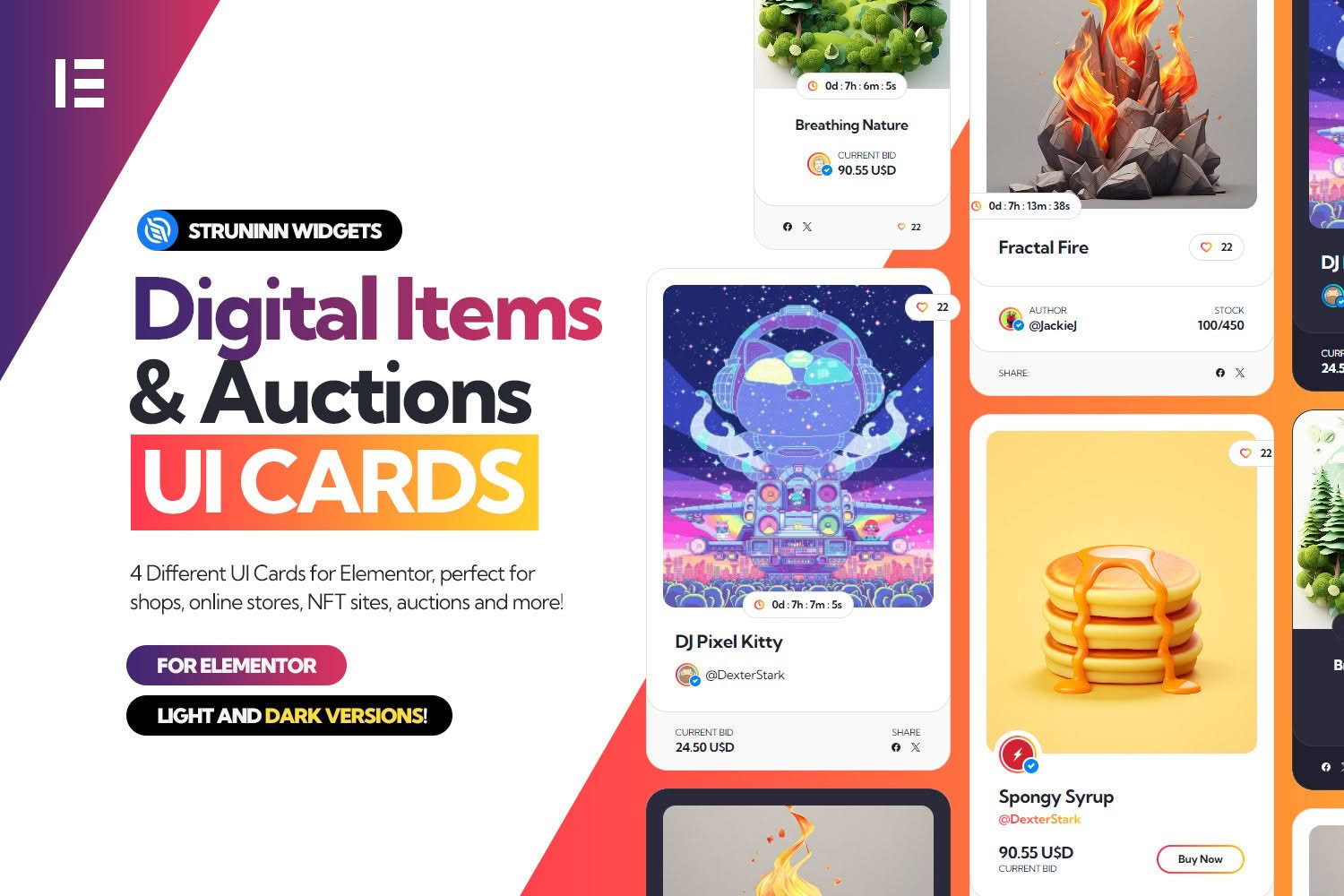
Digital Items and Auctions – Elementor UI Cards is a set of customisable card widgets for Elementor, aimed at WordPress sites that present digital goods or auction-style listings. The public listing and the vendor documentation describe the product briefly, so this overview concentrates on what those sources confirm and on how card widgets fit into a page built with Elementor. Points the public material leaves unanswered are set out near the end, so you can weigh them before using the product on a live site.
The vendor describes the product as a way to display customisable cards on a website. Its listing carries the name Digital Items and Auctions, which signals the intended context, and its tags include auction, NFT and digital. Those tags point to sites that handle digital items, auction formats and NFT-related content. The listing also links to a live preview and to screenshots of the designs, which are the best guide to how the cards look, because the written text does not describe them.
The product name and tags are the clearest indication of its purpose. The vendor’s text does not list the fields that each card displays, so do not assume that every card shows a photograph, a title, a status label or a countdown until you have confirmed it in the live preview or the documentation.
The vendor documentation describes three routes for showing the widgets. Each route has its own documentation page, so it helps to understand all three before you start building.
The most direct route runs through the Elementor editor. Once the plugin is installed, its widgets appear in the editor, and you can insert them into any Elementor page in much the same way you would add a heading or a button. This route suits designers and content editors who build pages visually and prefer not to work with code.
The documentation also states that shortcodes can display the widgets within WordPress posts and pages. A shortcode is a short tag placed in the content of a post or page, and WordPress replaces it with the output when the page loads. Shortcodes are most relevant on sites that publish content outside Elementor. The listing marks the product as not optimised for the block editor, so test any shortcode placement in the editor you actually use.
The third route is aimed at developers. According to the documentation, each widget template has a function that returns its HTML, and arguments passed to that function change the output. The documentation marks this route as requiring developer knowledge, and a theme or plugin developer who needs the markup inside a custom template would use it in place of the visual editor. The introduction page does not list those arguments, so the template-function documentation is the place to check them before you build on the route.
The product fits site owners who run a directory, marketplace or content site around digital goods and who want card-style blocks rather than plain lists. Its name points to auction-style content, and the NFT and digital tags add to that picture, so operators in those areas form the most natural audience. Agencies and freelancers who build Elementor sites for clients may also find it useful, provided the client’s content suits a card format.
Because the vendor marks the template-function route as requiring developer knowledge, the product serves two groups in different ways. Visual builders will mostly work through the Elementor widgets, while developers can call the functions from custom templates. Choosing the route early avoids rebuilding pages later, so decide who will maintain the pages before you begin.
Elementor is a visual page builder for WordPress. You open a page in the editor, add sections and columns, and then place widgets into those columns by dragging them from the widget panel. Once this plugin is active, its widgets appear in that panel, so the card widgets follow the same general workflow as other Elementor elements.
A sensible approach is to build one card on a test page, check how it looks, and then reuse the layout on the pages that need it. Keep the text in each card short, use the same heading level across the page, and confirm that the cards line up when the page is viewed on a narrow phone screen. Preview the page in the editor’s responsive modes as well as on a real device, because a card that looks balanced on a wide monitor can wrap awkwardly on a small screen.
The documentation states that the Elementor plugin is required. The product listing says it is compatible with Elementor but does not give a minimum Elementor version. For WordPress, the listing shows version 6.5.x as the software version it names. The listed browsers are Firefox and Chrome, so check the pages in any other browser your visitors use.
The listing was last updated in June 2024, and it does not say whether newer WordPress or Elementor releases have been checked. Before going live, install the product on a staging copy that uses your current theme and plugins, load every page that carries the cards, and watch for layout or script conflicts. Record the WordPress and Elementor versions you tested with, so the same checks can be run after each update.
Card layouts work best when every card carries the same kinds of information, so visitors can scan them quickly. Decide what each card should communicate before you place any widgets, and write the wording for every card in the same order. This makes the page easier to maintain when items change or are added.
Accessibility deserves attention as well. Check that text on any coloured background has enough contrast, that links and buttons can be reached with a keyboard, and that images carry sensible alternative text. The listing does not describe accessibility features, so these checks remain your responsibility on any page you build.
Keep the number of card grids on a single page moderate. Several large grids packed with images can slow a page down, and visitors may struggle to tell where one group of information ends and the next begins. Break long pages into sections with clear headings, and use white space to separate the groups.
A catalogue of digital items is easier to browse when each entry follows the same pattern. Agree on how titles are written, how long descriptions can run, and which image proportions the site uses, then apply those rules before any cards are built. Consistency also makes it easier to move an item from one page to another without rewriting it, and it helps when several people contribute to the same listings.
Auction-style content adds its own requirements. Decide early whether every item will show the same kinds of detail or whether different categories need different information, and record those decisions in a short style guide. A written guide keeps new contributors aligned and reduces the number of corrections needed after launch. Revisit the guide when the site’s categories change, so the cards continue to reflect the current catalogue.
Build a test page with a realistic sample of items rather than one or two placeholder entries. Include some very long titles, some short ones, and at least one entry that uses unusual characters, then review how each one appears in the cards, whatever fields you choose to display. The aim is to find layout problems early, before the real catalogue arrives and the pages become harder to fix.
Repeat the test on a phone and on a tablet, and check the page in the browsers your visitors use most often. If a page loads slowly, look at how many cards appear at once and whether any images are unnecessarily large. These checks take little time and give a clearer picture than a single trial card.
Several important points are missing from the public material available for this entry. The listing does not name the fields each card displays, and it does not explain whether card content is typed in by hand or drawn from another source. It also does not describe colour, typography, spacing or hover options, and it does not include installation steps. The documentation links to separate pages covering setup, template functions, shortcodes and Elementor widgets, and those pages should be read before the product goes near a live site.
Where a detail matters for your project, check the live preview and the screenshots first, then test the product on a staging copy. If a needed field turns out to be missing, plan the page around what the cards actually show rather than assuming the product will add it later.


