

Updates for one year, unlimited sites, auto updates, and regular updates.
$3.99
 BookmarkBookmarked
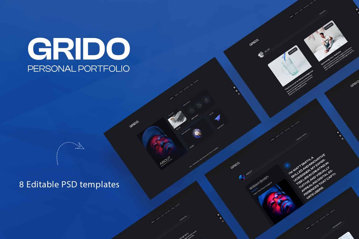
 Gridos – Creative Personal Portfolio is a sophisticated and visually striking WordPress theme meticulously crafted for creative professionals who demand a high-impact digital presence. By prioritizing a clean, grid-based aesthetic, this theme allows artists, designers, photographers, and freelancers to showcase their work with unparalleled clarity and style. It balances minimalist design principles with robust functionality, ensuring that your portfolio remains the focal point while providing a seamless, intuitive experience for your site visitors.
In the competitive landscape of digital portfolios, the Gridos – Creative Personal Portfolio theme stands out as a premier solution for those who value precision and elegance. Designed specifically for individuals who need to display visual content, this theme leverages a modular grid system that adapts fluidly to various screen sizes. Whether you are an architect showcasing structural blueprints, a graphic designer presenting brand identities, or a photographer curating a gallery, Gridos provides the structural foundation necessary to elevate your professional brand. The theme is built with modern web standards in mind, ensuring fast load times and a responsive architecture that performs reliably across desktop, tablet, and mobile devices.
The design philosophy behind Gridos is rooted in the concept of “content-first” presentation. The layout utilizes a sophisticated masonry-style grid that allows for diverse aspect ratios, ensuring that your images and project thumbnails are displayed without awkward cropping or distortion. The whitespace management is deliberate, creating a breathable environment that prevents visual clutter and keeps the viewer focused on the creative work itself. Navigation is handled through streamlined, unobtrusive menus that provide easy access to project categories, contact information, and biographical details. The typography is carefully selected to offer high readability, complementing the visual weight of the portfolio items. Every element of the layout is designed to be modular, allowing users to rearrange sections to better suit their specific storytelling needs, whether they prefer a traditional chronological portfolio or a curated selection of featured works.
Gridos is exceptionally versatile, making it an ideal choice for a wide array of creative professionals. For freelance graphic designers, the theme serves as a digital canvas that highlights case studies and design processes. Photographers benefit from the high-fidelity image rendering, which ensures that color accuracy and detail are preserved in every gallery. Architects and interior designers can utilize the grid layout to display high-resolution structural photography alongside floor plans and project descriptions. Furthermore, the theme is perfectly suited for creative agencies looking to build a lean, impactful landing page that converts visitors into leads. Because the theme is lightweight and focused, it is also an excellent choice for students and entry-level professionals who need a professional-grade portfolio that is easy to manage without requiring advanced coding knowledge.
The Gridos theme is built to integrate smoothly with the standard WordPress ecosystem. It adheres to the core WordPress coding standards, ensuring that it remains compatible with the vast majority of popular plugins. Whether you need to extend your site with contact form plugins, SEO optimization tools, or performance-enhancing caching solutions, Gridos provides a stable environment that avoids conflicts. The theme is designed to work harmoniously with the WordPress block editor, allowing users to leverage native editing capabilities to build out pages and posts. By maintaining a clean codebase, Gridos ensures that your site remains stable during WordPress core updates, providing peace of mind for users who want a “set it and forget it” solution for their portfolio maintenance.
While Gridos offers a polished look out of the box, it provides sufficient flexibility for users to inject their own personality into the design. Through the WordPress Customizer, users can adjust key visual elements such as accent colors, background styles, and font selections to align with their personal brand identity. The modular nature of the theme allows for the creation of unique page templates, enabling you to build a custom “About Me” page, a dedicated “Services” section, or a specialized “Contact” page that fits your specific business requirements. The theme avoids over-complicating the user experience with unnecessary bloat, instead focusing on providing a reliable framework that respects the user’s creative vision. This balance between structure and freedom makes Gridos an excellent choice for those who want a professional portfolio that is both easy to set up and simple to maintain over the long term.


