

Updates for one year, unlimited sites, auto updates, and regular updates.
$3.99
 BookmarkBookmarked
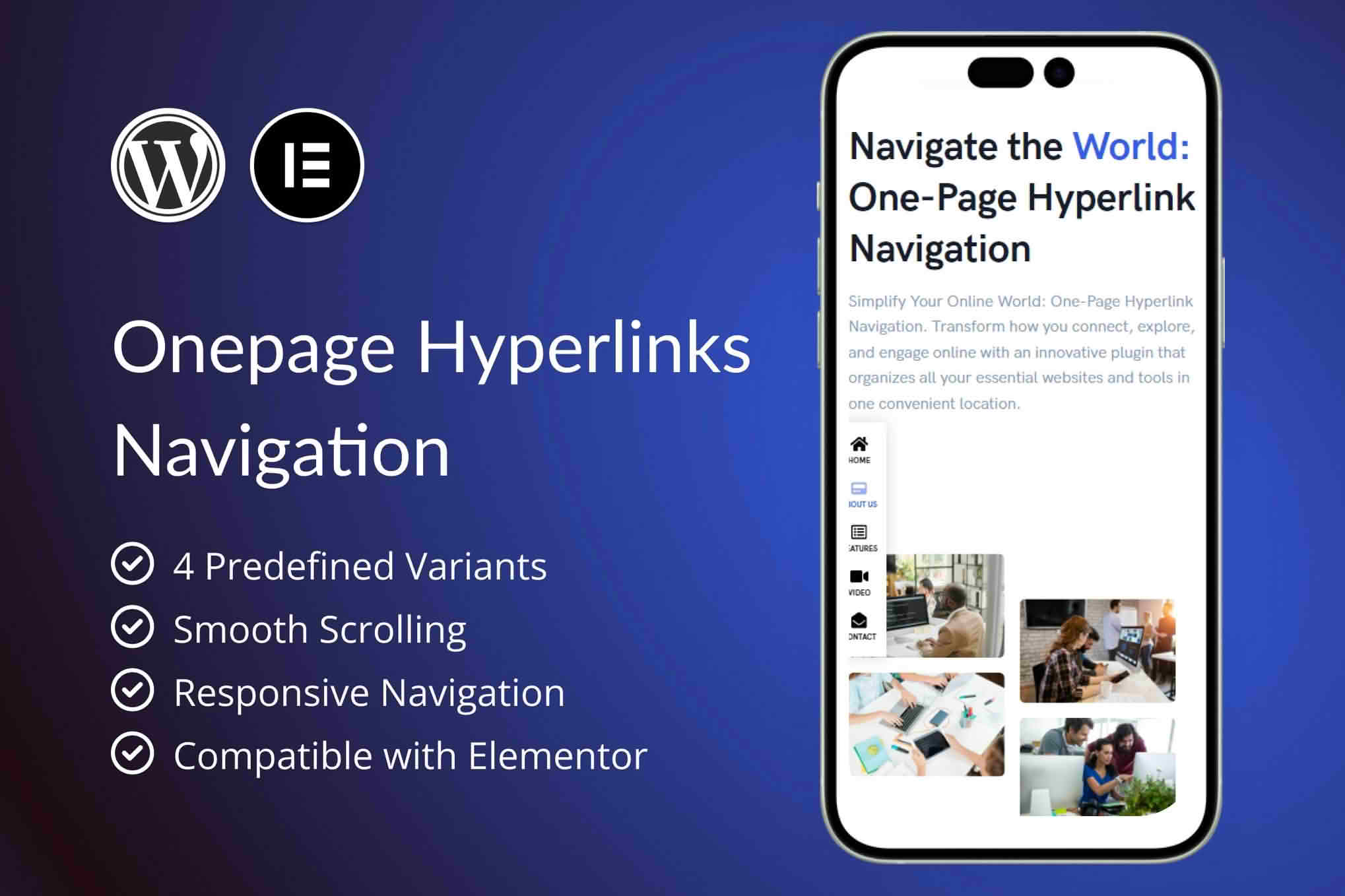
Single-page websites and long landing pages ask visitors to scroll past several sections before they reach the content they came for. OnePage Hyperlinks Navigation adds a navigation menu designed for that layout. Links can jump to sections on the same page, and the link for whichever section is currently on screen is highlighted, so visitors always know where they are. The plugin works as an add-on for Elementor, which means the menu is built in the same editor as the rest of your page. It can also be placed with a shortcode when you need it outside the widget picker.
Once the plugin is active, Elementor gains a navigation widget called OnePage Hyperlinks Navigation. You search for it in the widget panel, drag it onto the page and set its options. The plugin has no separate settings screen of its own, so every choice lives inside the widget. That keeps layout decisions in one place, with the menu and the sections it points to arranged and reviewed side by side.
The Version setting offers four preset styles, labeled v1 through v4. Each preset gives the menu a different visual treatment, so you can choose the one that suits your design instead of reshaping the design around the menu. Some options belong to particular versions only. Orientation, which switches the menu between a horizontal row and a vertical stack, is available in the first version. Per-device icon visibility is also limited to that version. Circle-style markers for the active link, together with their border and fill colors, are set in the second version.
The Position setting offers nine locations arranged in a three-by-three grid. The top, middle and bottom rows combine with the left, center and right columns, which gives you nine anchor points. Position matters on a one-page site because the menu has to be easy to reach without covering the content visitors came to read. Check each position on a laptop and on a phone, and look at how the menu sits over a call-to-action button or a contact form when the page is scrolled partway down.
In the first version, orientation can be set to a horizontal row or a vertical stack, and that choice works alongside position. A horizontal row placed along the top of the screen suits a short list of sections, while a vertical stack can handle a longer list without taking up much width. Experiment with both before settling on a layout, and keep the number of items small enough that each label stays readable.
Every item in the menu has three fields. The link label is the text visitors read. The link is the destination, which can be a section on the same page, identified by its ID, or an external page or site. Linking to external pages is useful if your one-page site also points to a blog, a booking tool or an online shop. The third field is the icon, which appears only in the first version and lets you pick a symbol from an icon library.
Clear labels make the menu easier to scan. Use words that describe each section, such as Our Approach or Client Stories, rather than generic phrases like Read More or Click Here. Descriptive labels also help visitors who navigate with a keyboard or a screen reader, because each item names its destination clearly.
When a visitor selects a menu item, the page scrolls smoothly to the matching section rather than jumping to it. As the visitor moves down the page, the menu follows along and highlights the link for the section now on screen. Both behaviors happen automatically, so you do not need to write scripts or maintain a list of positions for each section. The highlight uses the active label and active background colors you choose, and the second version can also use its circle marker to show the current section.
Long pages feel more organized when the navigation reflects the current position rather than acting as a static list of links. The effect is especially helpful on pages where sections differ in length, because the highlight keeps pace with the reader. Test the behavior on your own layout, particularly if your theme includes a fixed header, since a header can cover part of a section after the page scrolls to it.
Label typography controls the typeface, size and weight of the menu text, so the navigation can match the headings and body copy elsewhere on the page. Each version provides its own color controls for the active state. The active label color and the active background color decide how the highlighted link looks, while the second version adds a border color and a fill color for the circle that marks the current section.
Because every version exposes a different set of controls, choose the version before you fine-tune the palette. That way you are not adjusting options that the chosen version never uses. Once the version is set, compare the active state with the rest of the menu on both light and dark backgrounds, so the current section stands out for every visitor.
In the first version, icon visibility can be chosen separately for desktop and mobile screens. A label that reads clearly on a wide monitor may need an icon to stay understandable on a phone, or the reverse may be true. Setting the two screen sizes independently gives you that control without duplicating the menu. The menu adapts to every screen size, phones included, so visitors on any device can move between sections without difficulty.
Icons are optional. If your design relies on clean text, you can keep the menu label-only and still enjoy smooth scrolling and active highlighting.
The plugin also registers a shortcode, ohn-builder-shortcode, for situations where the Elementor widget is not the most convenient place to add the menu. The shortcode accepts a version, a position, an orientation, a setting for mobile icons and color values for each version. You can place it in a text widget, in a shortcode block in the block editor, or in a theme template through the do_shortcode function. For example, setting the version to v2 and the position to top-right displays the second version in the upper right area of the screen.
The version and position values are the same whichever route you take, so you can move between the widget and the shortcode without relearning the options. Choose one approach for each page where possible, because a single method is easier to revisit when you later change the menu.
Installation follows the standard route for WordPress plugins. Open Plugins in the dashboard, choose Add New, select Upload Plugin, pick the plugin archive from your computer and click Install Now, then Activate. The plugin is designed to work as soon as it is active, with no separate settings screen to configure. Sample content is also available for import through the WordPress importer, which you can open from the Tools menu.
Importing the sample content is optional. It gives you ready-made material to compare against your own pages, which can be helpful when you are learning how the widget, the versions and the positions interact.
Several types of site suit this style of navigation. A consultant or small agency can present services, case studies and contact details on a single page, with the menu guiding readers from one part to the next. A product launch page can move visitors from the opening banner to the features, customer comments and a sign-up form. A personal portfolio can link to projects, background information and an inquiry section. Event sites often benefit too, because a schedule, a list of speakers and a venue section all fit into one menu.
In each case the aim is the same: reduce the effort a visitor needs to find a specific part of the page. A well-built menu saves scrolling, shows the reader where the content is and invites them to explore further.
Because the widget lives inside Elementor, the menu fits into the same workflow as the sections it links to. Build the sections first, give each target section its ID, and then add the navigation widget to the top or bottom of the page. The vendor documentation lists Elementor integration as the main requirement and describes shortcode use in text widgets, shortcode blocks and page templates. It does not state minimum versions for WordPress, Elementor or PHP, so confirm compatibility with your own stack before publishing.
Pay attention to how your theme handles headers and anchored sections. The documentation does not mention an offset setting for fixed headers, so if a section lands partly beneath the header after a link is selected, adjust that section’s layout in your theme and test again. A short check on desktop, tablet and phone will catch most of these issues before visitors do.
OnePage Hyperlinks Navigation gives single-page and long-scrolling sites a navigation layer that matches the way visitors read them. The Elementor widget and the shortcode keep setup in familiar places, four versions and nine positions offer room for different designs, and the automatic highlight keeps readers oriented as they scroll. Plan your section IDs, pick the version that fits your layout and check the result on phones and tablets before you publish.


