

Updates for one year, unlimited sites, auto updates, and regular updates.
$3.99
 BookmarkBookmarked
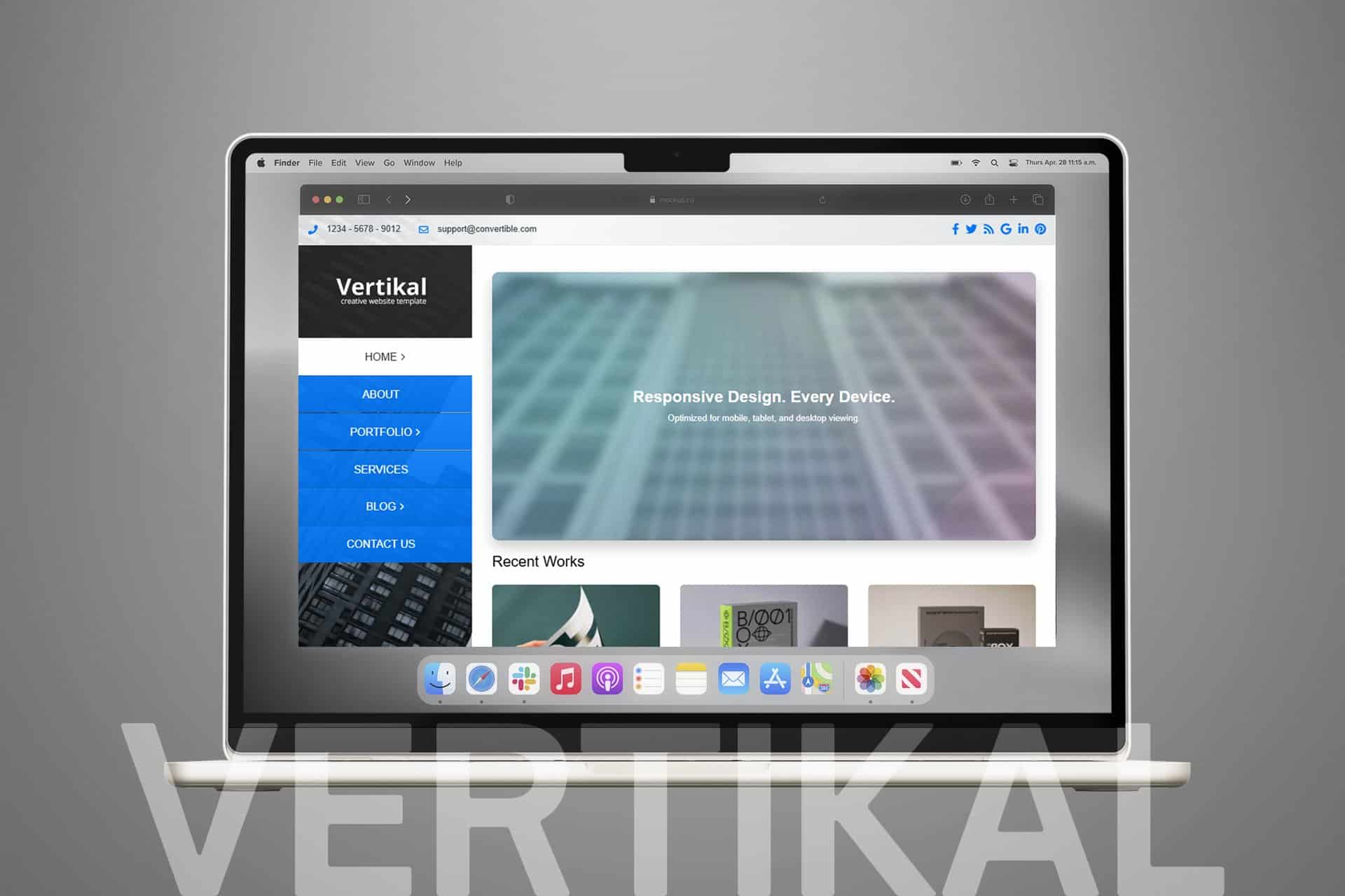
 Vertikal is a sophisticated, responsive WordPress theme engineered to provide a seamless browsing experience across all devices, from high-resolution desktop monitors to compact mobile screens. Designed with a focus on clean aesthetics and functional versatility, this theme serves as a robust foundation for professionals, creative agencies, and businesses looking to establish a strong digital presence. By prioritizing performance and user experience, Vertikal ensures that your content remains the focal point while offering a suite of tools that simplify the process of building a professional-grade website without requiring extensive technical expertise.
The Vertikal WordPress theme is built upon the principles of modern web design, emphasizing clarity, responsiveness, and ease of use. In an era where mobile traffic often outweighs desktop usage, Vertikal addresses the need for a fluid layout that adapts dynamically to various screen sizes. Whether you are a freelancer showcasing a portfolio, a small business owner launching a corporate site, or a blogger looking for a refined reading experience, Vertikal provides the structural integrity and visual appeal necessary to engage your audience effectively. The theme is developed with clean, semantic code, ensuring that it remains lightweight and fast-loading, which is essential for both user retention and search engine optimization.
At its core, Vertikal utilizes a responsive grid system that allows for flexible content arrangement. The design philosophy leans toward a minimalist aesthetic, utilizing generous whitespace and balanced typography to guide the user’s eye through the content. The layout is inherently fluid, meaning that images, text blocks, and navigation elements resize and reposition themselves based on the viewport width. This ensures that your website maintains its visual hierarchy and readability regardless of whether it is viewed on a smartphone, tablet, or desktop computer.
The header and navigation structures are designed to be intuitive, allowing users to find information quickly. Vertikal supports various layout configurations, enabling users to choose between full-width designs or boxed layouts depending on their specific branding requirements. The theme also incorporates a modular approach to page building, allowing for the creation of unique landing pages that do not feel repetitive or cluttered. By focusing on a clean, professional look, Vertikal provides a neutral canvas that can be easily adapted to fit a wide range of industry styles, from high-tech corporate identities to artistic, minimalist portfolios.
Vertikal is a highly adaptable theme that serves a diverse range of professional and personal needs. For creative professionals, such as photographers, graphic designers, and architects, the theme’s clean layout provides an ideal backdrop for high-quality imagery and project showcases. The responsive grid ensures that portfolios look just as impressive on a mobile device as they do on a large screen, which is vital for professionals who share their work on the go.
For small businesses and corporate entities, Vertikal offers a professional appearance that builds trust with potential clients. The theme’s ability to handle service descriptions, team member profiles, and contact forms with ease makes it a reliable choice for service-based industries. Additionally, bloggers and content creators benefit from the theme’s focus on typography and readability, which keeps visitors engaged with long-form content. Because the theme is so flexible, it can also be utilized for landing pages, event promotion sites, or simple brochure-style websites that require a quick deployment without sacrificing quality.
Compatibility is a cornerstone of the Vertikal theme. It is designed to work harmoniously with the core WordPress ecosystem, ensuring that it remains stable even as the platform evolves. The theme follows standard WordPress coding practices, which means it is compatible with the vast majority of popular plugins. Whether you need to add contact forms, social media sharing buttons, or advanced SEO tools, Vertikal provides a stable environment for these integrations to function without conflict.
Furthermore, the theme is built to support the WordPress block editor (Gutenberg), allowing users to leverage the latest content creation tools provided by the core software. This integration ensures that you can create complex page layouts using blocks without needing to rely on proprietary page builders. By adhering to these standards, Vertikal ensures that your website remains future-proof and easy to maintain, reducing the likelihood of technical debt as your site grows and your requirements change over time.
Customization in Vertikal is handled primarily through the native WordPress Customizer, which provides a live preview of your changes before they are published. This allows users to adjust site identity, colors, and layout settings in real-time, making the design process both efficient and user-friendly. The theme provides enough options to allow for significant visual differentiation while preventing the user from becoming overwhelmed by an excessive number of settings.
Beyond the Customizer, Vertikal is designed to be developer-friendly. For those with knowledge of CSS, the theme includes dedicated areas for adding custom styles, allowing for granular control over the design without modifying core theme files. This approach ensures that your customizations are preserved during theme updates. The combination of user-friendly settings for beginners and clean, accessible code for developers makes Vertikal a balanced solution that can grow alongside your project. Whether you are performing a simple color change or implementing custom layout adjustments, the theme provides the necessary hooks and structural flexibility to achieve your desired aesthetic goals.


